01 · Graphic design movement · 1950s onward

Swiss Modernism

Also known as International Typographic Style

Precise, rational, systematic

Draft profile · not yet reviewed against sources

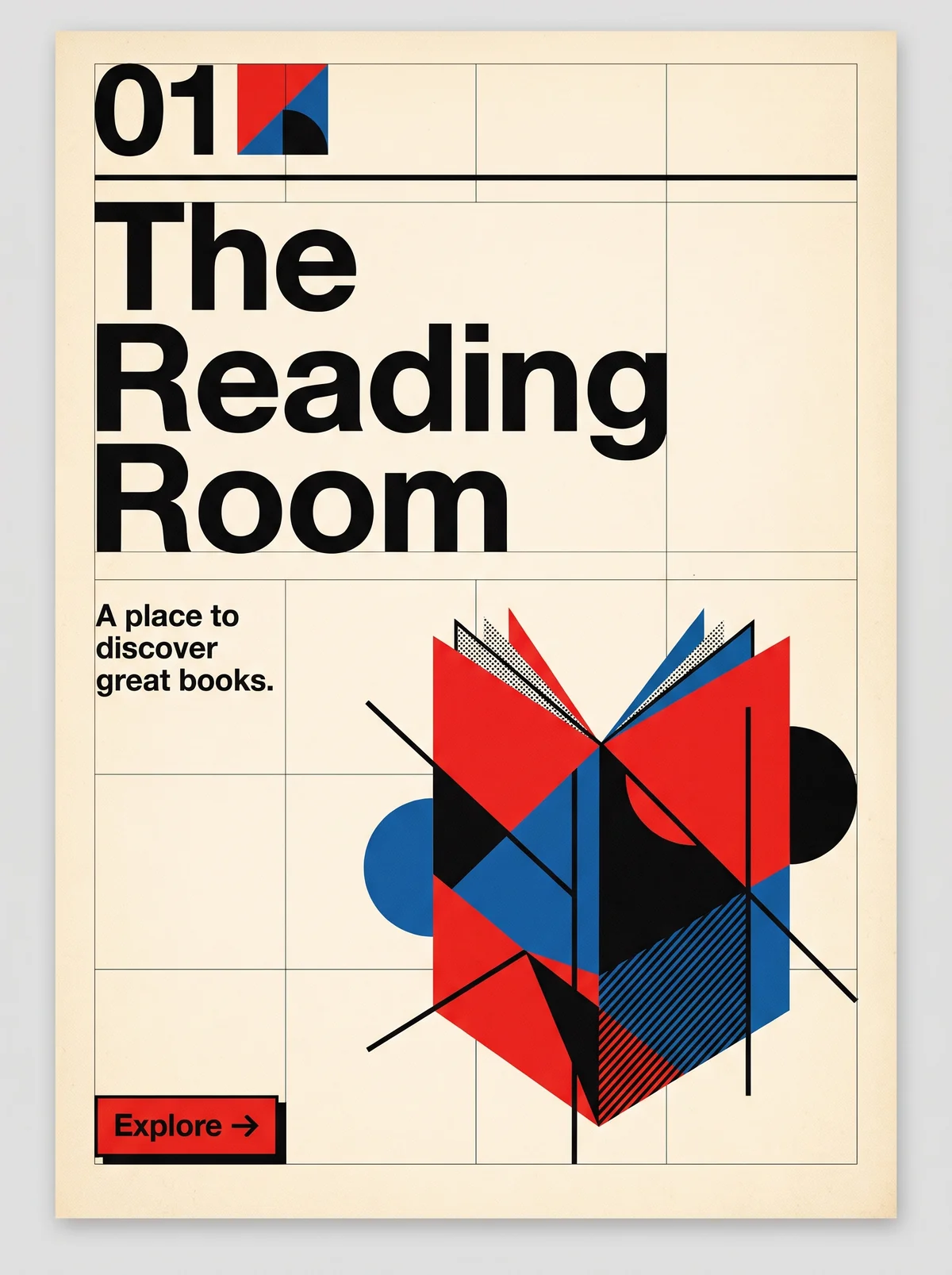
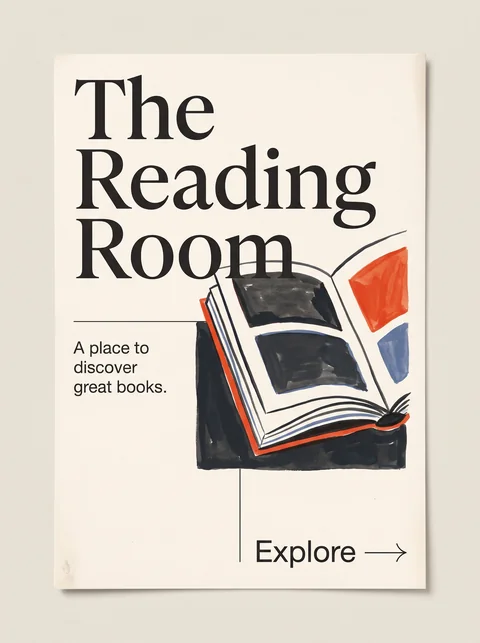
Poster on off-white paper with a visible grid of fine rules. Top left, the index number 01 beside a small red, blue, and black square. Below, "The Reading Room" in a heavy black sans-serif, set flush left on three lines. A small tagline reads "A place to discover great books." At right, an open book built from overlapping red, blue, and black geometric planes, circles, and diagonal lines. Bottom left, a small red button labeled "Explore" with an arrow.
The Reading Room in Swiss Modernism. An interpretation of the shared “The Reading Room” brief, not a historical work. Supplied by Ryan Grissinger.

Philosophy

Clarity through systematic visual communication. Design should serve the content objectively, with structure made visible through the grid.

Historical context

Origins
Switzerland, centered on the design schools of Zurich and Basel.
Period
1950s onward
Influences
Constructivism, Bauhaus, De Stijl, New Typography
Notable figures
Josef Müller-Brockmann, Armin Hofmann, Emil Ruder, Max Bill, Karl Gerstner

Drafted from general design history. Sources pending.

What the example shows

Observations tied to the taxonomy, including where the example departs from the profile.

  • 06 · Layout & Grid

    A visible modular grid of fine rules organizes the whole poster. Title, tagline, and button all sit on it.

  • 11 · Hierarchy & Emphasis

    Hierarchy comes from size and weight alone: a heavy flush-left title, then small tagline type, then the button.

  • 01 · Color

    Black and red on off-white, plus blue. The profile calls for black, white, and one accent, so the blue is a departure, and it pulls the poster toward Bauhaus and De Stijl. Red is reserved for the index mark and the Explore button, so it signals action.

  • 07 · Space & Density

    The empty space in the left column and lower half gives the title its weight.

  • 13 · Imagery & Illustration

    The book is reduced to overlapping geometric planes. Its circles and diagonals lean toward Bauhaus and Constructivism, a reminder that Swiss Modernism inherited from both.

Often confused with

The styles closest to Swiss Modernism, and what sets each apart.

Bauhaus

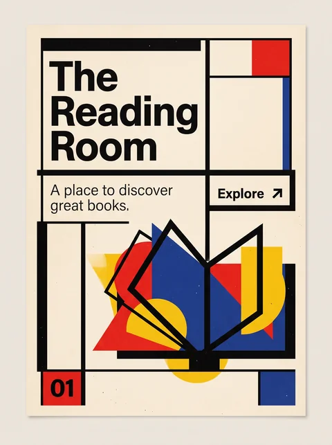
Bauhaus treats color and geometric form as expressive material; Swiss Modernism hands the work to a modular grid and neutral type, and keeps color to a minimum.

01 · Color
Swiss Modernism Black and white with one accent, usually red.
Bauhaus Primary red, yellow, and blue used in flat fields.
02 · Typography
Swiss Modernism Neutral grotesques such as Akzidenz-Grotesk and Helvetica, set flush left.
Bauhaus Geometric, constructed letterforms, including lowercase-only experiments.
06 · Layout & Grid
Swiss Modernism A mathematical modular grid governs every element.
Bauhaus Blocks, bars, and shapes balanced by eye.
13 · Imagery & Illustration
Swiss Modernism Objective photography or no imagery; type is often the image.
Bauhaus Abstract shapes and photomontage share the page with type.
20 · Historical & Cultural References
Swiss Modernism Swiss poster and typography practice of the 1950s and 1960s that systematized earlier modernism.
Bauhaus A German art school, 1919 to 1933, uniting art, craft, and industry.
View Bauhaus

Contemporary Editorial Design

Swiss Modernism keeps type neutral and the grid absolute; Contemporary Editorial gives the page a voice, with expressive serifs, art-directed images, and a grid it breaks on purpose.

02 · Typography
Swiss Modernism One neutral grotesque throughout.
Contemporary Editorial Design High-contrast display serifs paired with a sans-serif.
06 · Layout & Grid
Swiss Modernism A grid that is never broken.
Contemporary Editorial Design A grid broken once, deliberately.
13 · Imagery & Illustration
Swiss Modernism Objective photography or none.
Contemporary Editorial Design Commissioned illustration and art-directed photography.
19 · Mood & Personality
Swiss Modernism Impersonal and objective.
Contemporary Editorial Design Literary and opinionated.
View Contemporary Editorial Design

New Wave Typography

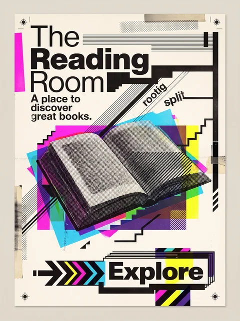
New Wave started from Swiss Modernism and broke it on purpose, with stepped baselines, mixed weights, and layered images where Swiss design keeps strict order.

02 · Typography
Swiss Modernism Consistent weights and even spacing.
New Wave Typography Weight, size, and spacing change within a word or line.
06 · Layout & Grid
Swiss Modernism A strict modular grid with flush-left text.
New Wave Typography Bent and broken grids, with stair-stepped text.
05 · Texture & Material
Swiss Modernism Clean, flat print surfaces.
New Wave Typography Visible halftones, line screens, and overprinting.
19 · Mood & Personality
Swiss Modernism Calm, rational, and objective.
New Wave Typography Playful, intellectual, and experimental.
20 · Historical & Cultural References
Swiss Modernism Zurich and Basel, 1950s and 1960s.
New Wave Typography Basel and Los Angeles, late 1970s and 1980s, led by Wolfgang Weingart and April Greiman.
View New Wave Typography

Flat Design

Flat Design carries Swiss clarity onto screens with bright solid colors, simple icons, and obvious tap targets; Swiss Modernism is a print discipline of strict grids and restrained color.

01 · Color
Swiss Modernism Black and white with one accent.
Flat Design Several saturated, friendly colors.
02 · Typography
Swiss Modernism Grotesques at dramatic poster scale, flush left.
Flat Design Rounded or geometric sans-serifs at interface sizes.
13 · Imagery & Illustration
Swiss Modernism Photography or pure typography.
Flat Design Simple geometric icons and illustrations.
17 · Interaction & Feedback
Swiss Modernism Built for reading, on posters and in print.
Flat Design Built for tapping, with obvious buttons and states.
20 · Historical & Cultural References
Swiss Modernism Swiss print design of the 1950s and 1960s.
Flat Design Digital interfaces, roughly 2010 to 2015, reacting against skeuomorphism.
View Flat Design

De Stijl

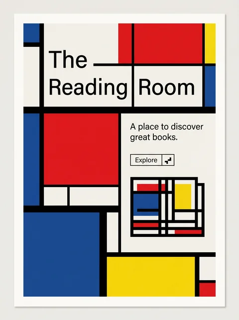
De Stijl is a strict art of horizontal and vertical planes in pure primaries; Swiss Modernism is a system for organizing information, with color held in reserve.

03 · Shape & Geometry
Swiss Modernism Any shape the content needs, ordered by the grid.
De Stijl Only rectangles and right angles, at least in Mondrian's strict version.
01 · Color
Swiss Modernism Mostly black and white, with one accent.
De Stijl Red, yellow, and blue with black, white, and gray, used as solid planes.
04 · Line & Borders
Swiss Modernism Hairline rules at most; alignment does the dividing.
De Stijl Heavy black lines divide the surface into fields.
02 · Typography
Swiss Modernism Neutral, highly legible grotesques.
De Stijl Blocky lettering built from rectangles.
19 · Mood & Personality
Swiss Modernism Objective, clear, and impersonal communication.
De Stijl A utopian search for universal harmony through abstraction.
View De Stijl

Comparisons are drafted from general design history and not yet checked against sources.

The style, layer by layer

Described with the Laboratory's shared vocabulary, from the elements up to digital behavior.

Foundation · fine art

The elements

Color
restrained high contrast
Typography
sans serif neutral hierarchical
Shape & geometry
rectilinear geometric
Line & borders
precise minimal
Texture & material
flat clean
Imagery
photographic abstract
Ornamentation
minimal

Graphic design adds

The principles

Layout & grid
modular rigid
Space & density
generous systematic
Balance
asymmetric controlled
Rhythm
regular
Hierarchy
clear structured
Contrast
strong deliberate

Web design adds

Digital expression

Dimensionality
flat
Motion
subtle functional
Interaction
direct predictable
Navigation
structured hierarchical

Across every layer

Mood and personality

precise rational systematic disciplined objective

Building in this style

Advisory guidance for a web interface. A demonstration may interpret the style differently.

Do

  • Use a consistent modular grid and let it show.
  • Prioritize typographic hierarchy through size and weight, not decoration.
  • Use whitespace deliberately as a structural element.
  • Align flush left, ragged right.
  • Let one strong accent color carry emphasis.

Avoid

  • Unnecessary ornamentation.
  • Decorative typography.
  • Inconsistent alignment.
  • Centered body text.

Working palette

  • #FFFFFF

    Background

  • #111111

    Foreground

  • #D62828

    Primary

  • #666666

    Secondary

Headings
neo grotesque sans
Body
neo grotesque sans
Corner radius
0px
Borders
minimal

Accessibility

  • Strong contrast and clear hierarchy make this one of the most accessible styles.
  • Check that the accent color is never the only signal for state.

Responsive behavior

  • Collapse the column grid by halving it rather than abandoning it.
  • Keep the baseline rhythm consistent across breakpoints.

Sources

Sources pending. This profile was drafted from general design history and has not yet been checked against primary or scholarly sources.

π