
22 · Digital design trend · 2010 onward, mainstream from 2013

Flat Design

Clean, efficient, digital

Draft profile · not yet reviewed against sources

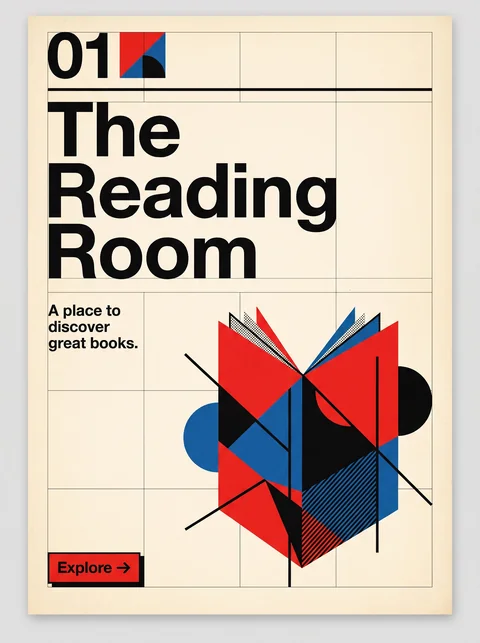
Rounded card with a teal border and a deep blue-teal background. At top center, "The Reading Room" in bold white sans-serif, with the tagline "A place to discover great books." below in a lighter weight. In the middle, an open book built from flat shapes in orange, yellow, red, white, and navy, with a red bookmark and a yellow bookmark, and small yellow, orange, and white sparkles and plus signs around it. At the bottom, a coral pill-shaped button labeled "Explore" with an arrow.
The Reading Room in Flat Design. An interpretation of the shared “The Reading Room” brief, not a historical work. Supplied by Ryan Grissinger.

Philosophy

Interfaces should be honest to the screen. Remove simulated depth and texture; let color, type, and layout do the work.

Historical context

Origins
Digital product design: Microsoft's Metro design language (2010) and Apple's iOS 7 (2013).
Period
2010 onward, mainstream from 2013
Influences
Swiss Modernism, Reaction against Skeuomorphism
Notable figures
Jony Ive

Drafted from general design history. Sources pending.

What the example shows

Observations tied to the taxonomy, including where the example departs from the profile.

  • 01 · Color

    Solid, saturated colors with no gradients. Teal and navy ground a warm orange, yellow, and coral accent set.

  • 03 · Shape & Geometry

    The book is made of simple geometric shapes and overlapping planes. Depth comes only from color and overlap.

  • 15 · Dimensionality

    There are no bevels, glows, or realistic shadows. Surfaces are deliberately flat.

  • 02 · Typography

    A clean, friendly geometric sans-serif in two weights, centered and easy to read.

  • 17 · Interaction & Feedback

    The coral pill stands out against the teal. Color and shape alone tell you it is tappable.

Often confused with

The styles closest to Flat Design, and what sets each apart.

Swiss Modernism

Flat Design carries Swiss clarity onto screens with bright solid colors, simple icons, and obvious tap targets; Swiss Modernism is a print discipline of strict grids and restrained color.

01 · Color
Flat Design Several saturated, friendly colors.
Swiss Modernism Black and white with one accent.
02 · Typography
Flat Design Rounded or geometric sans-serifs at interface sizes.
Swiss Modernism Grotesques at dramatic poster scale, flush left.
13 · Imagery & Illustration
Flat Design Simple geometric icons and illustrations.
Swiss Modernism Photography or pure typography.
17 · Interaction & Feedback
Flat Design Built for tapping, with obvious buttons and states.
Swiss Modernism Built for reading, on posters and in print.
20 · Historical & Cultural References
Flat Design Digital interfaces, roughly 2010 to 2015, reacting against skeuomorphism.
Swiss Modernism Swiss print design of the 1950s and 1960s.
View Swiss Modernism

Comparisons are drafted from general design history and not yet checked against sources.

The style, layer by layer

Described with the Laboratory's shared vocabulary, from the elements up to digital behavior.

Foundation · fine art

The elements

Color
bright solid saturated
Typography
sans serif geometric
Shape & geometry
geometric simple
Line & borders
minimal invisible
Texture & material
flat smooth
Imagery
iconographic illustrated
Ornamentation
minimal

Graphic design adds

The principles

Layout & grid
modular
Space & density
balanced
Balance
stable
Rhythm
regular
Hierarchy
clear
Contrast
strong

Web design adds

Digital expression

Dimensionality
flat
Motion
subtle
Interaction
immediate
Navigation
hierarchical

Across every layer

Mood and personality

clean efficient digital friendly

Building in this style

Advisory guidance for a web interface. A demonstration may interpret the style differently.

Do

  • Use solid fills with no gradients or textures.
  • Rely on color and size for hierarchy.
  • Use simple, consistent icon sets.
  • Keep components uniform across the system.

Avoid

  • Shadows, bevels, and gloss.
  • Textures and photographs as surfaces.

Working palette

  • #FFFFFF

    Background

  • #2C3E50

    Foreground

  • #3498DB

    Primary

  • #2ECC71

    Secondary

  • #E74C3C

    Accent

Headings
geometric sans
Body
geometric sans
Corner radius
4px
Borders
none

Accessibility

  • Flat controls can lose affordance; make buttons look clickable.
  • Bright fills often fail contrast with white labels.

Responsive behavior

  • Flat systems reflow cleanly; keep tap targets at least 44px.

Sources

Sources pending. This profile was drafted from general design history and has not yet been checked against primary or scholarly sources.

π