26 · Art movement · 1917–1931

De Stijl

Also known as Neoplasticism

Geometric, mathematical, disciplined

Draft profile · not yet reviewed against sources

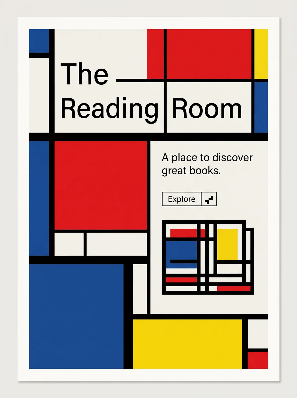
Poster on off-white paper, divided by thick black horizontal and vertical lines into rectangles filled with red, blue, yellow, and off-white. At upper left, "The" and below it "Reading" and "Room" in a thin black sans-serif, each word in its own ruled cell. A large red rectangle sits at middle left, a large blue one at lower left, and a wide yellow one at the bottom. At right, the tagline "A place to discover great books." above a small outlined button labeled "Explore" with a stepped-square icon. Below the button, a book drawn as a grid of black rules with small red, blue, yellow, and white blocks.
The Reading Room in De Stijl. An interpretation of the shared “The Reading Room” brief, not a historical work. Supplied by Ryan Grissinger.

Philosophy

Universal harmony through pure abstraction: straight lines, right angles, and primary colors.

Historical context

Origins
The Netherlands.
Period
1917–1931
Influences
Cubism, Theosophy
Notable figures
Piet Mondrian, Theo van Doesburg, Gerrit Rietveld, Bart van der Leck, Vilmos Huszár

Drafted from general design history. Sources pending.

What the example shows

Observations tied to the taxonomy, including where the example departs from the profile.

  • 06 · Layout & Grid

    Everything sits on a strict orthogonal grid of heavy black rules. There are no diagonals, curves, or circles.

  • 01 · Color

    Pure red, blue, and yellow with black and white. Color is used in flat blocks of unequal size.

  • 09 · Balance & Tension

    Balance is asymmetric. A large blue field at lower left offsets the cluster of text at upper right, as in Mondrian's compositions.

  • 13 · Imagery & Illustration

    The book is reduced to the same grid vocabulary as the poster, so image and layout speak one language.

  • 02 · Typography

    Thin, neutral sans-serif type stays quiet. The grid, not the lettering, carries the design.

Often confused with

The styles closest to De Stijl, and what sets each apart.

Swiss Modernism

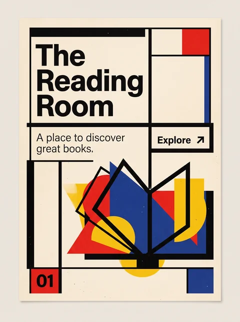
De Stijl is a strict art of horizontal and vertical planes in pure primaries; Swiss Modernism is a system for organizing information, with color held in reserve.

03 · Shape & Geometry
De Stijl Only rectangles and right angles, at least in Mondrian's strict version.
Swiss Modernism Any shape the content needs, ordered by the grid.
01 · Color
De Stijl Red, yellow, and blue with black, white, and gray, used as solid planes.
Swiss Modernism Mostly black and white, with one accent.
04 · Line & Borders
De Stijl Heavy black lines divide the surface into fields.
Swiss Modernism Hairline rules at most; alignment does the dividing.
02 · Typography
De Stijl Blocky lettering built from rectangles.
Swiss Modernism Neutral, highly legible grotesques.
19 · Mood & Personality
De Stijl A utopian search for universal harmony through abstraction.
Swiss Modernism Objective, clear, and impersonal communication.
View Swiss Modernism

Bauhaus

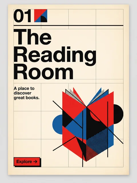
Both use primaries and pure geometry, but De Stijl limits itself to horizontals, verticals, and rectangles, while Bauhaus works freely with circles, triangles, and diagonals.

03 · Shape & Geometry
De Stijl Rectangles only, on horizontals and verticals.
Bauhaus Circle, triangle, and square, plus diagonals.
09 · Balance & Tension
De Stijl Asymmetric balance held in static tension.
Bauhaus Dynamic compositions, often on the diagonal.
02 · Typography
De Stijl Lettering built from rectangular strokes to match the grid.
Bauhaus Systematic sans-serifs, like Herbert Bayer's universal alphabet.
13 · Imagery & Illustration
De Stijl Pure abstraction, with no representational imagery.
Bauhaus Embraced photography and photomontage.
20 · Historical & Cultural References
De Stijl A Dutch movement and magazine, 1917 to 1931, led by Mondrian and van Doesburg.
Bauhaus A German school teaching design for industry, 1919 to 1933.
View Bauhaus

Comparisons are drafted from general design history and not yet checked against sources.

The style, layer by layer

Described with the Laboratory's shared vocabulary, from the elements up to digital behavior.

Foundation · fine art

The elements

Color
primary black white
Typography
geometric sans blocky
Shape & geometry
rectilinear orthogonal
Line & borders
heavy black orthogonal
Texture & material
flat
Imagery
abstract
Ornamentation
minimal

Graphic design adds

The principles

Layout & grid
asymmetric orthogonal
Space & density
balanced open
Balance
asymmetric dynamic equilibrium
Rhythm
regular
Hierarchy
structured
Contrast
strong primary

Web design adds

Digital expression

Dimensionality
flat
Motion
static
Interaction
direct
Navigation
structured

Across every layer

Mood and personality

geometric mathematical disciplined pure

Building in this style

Advisory guidance for a web interface. A demonstration may interpret the style differently.

Do

  • Divide the canvas with heavy black horizontal and vertical lines.
  • Fill a few blocks with red, yellow, or blue; leave most white.
  • Use only right angles.
  • Balance asymmetrically.

Avoid

  • Curves and diagonals.
  • Secondary or muted colors.
  • Ornament.

Working palette

  • #FFFFFF

    Background

  • #111111

    Foreground

  • #DD0100

    Primary

  • #225095

    Secondary

  • #FAC901

    Accent

Headings
geometric sans
Body
geometric sans
Corner radius
0px
Borders
heavy black grid

Accessibility

  • Yellow blocks need dark text; do not place text on red or blue without checking contrast.

Responsive behavior

  • Recompose the grid at each breakpoint rather than scaling it down.

Sources

Sources pending. This profile was drafted from general design history and has not yet been checked against primary or scholarly sources.

π