
30 · Interface treatment · Desktop metaphors from the early 1980s; peak 2007–2013

Skeuomorphism

Physical, tactile, familiar

Draft profile · not yet reviewed against sources

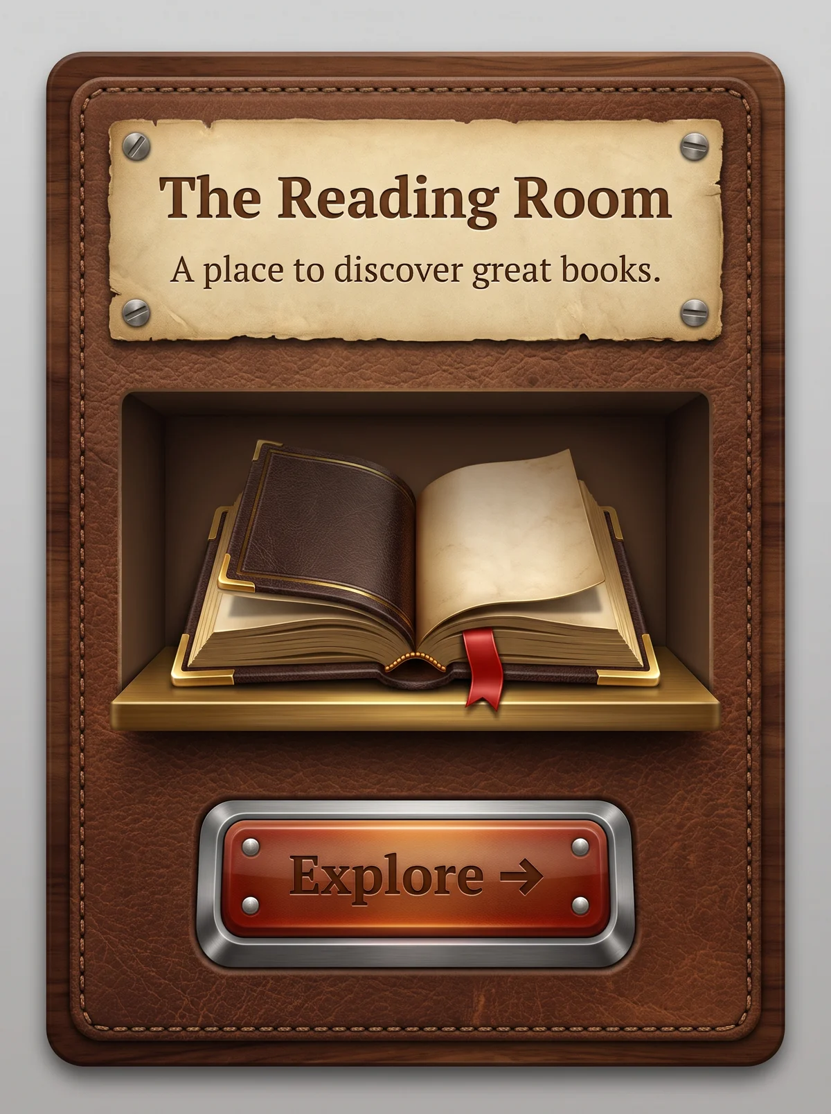
Stitched brown leather panel inside a walnut wood frame. At the top, a torn parchment plate held by four screws, with "The Reading Room" and the tagline "A place to discover great books." in embossed brown serif type. In the middle, a recessed wooden shelf niche holding an open leather-bound book with gold corners and a red ribbon bookmark. At the bottom, a glossy red-orange button in a brushed-metal bezel with four rivets, labeled "Explore" with an arrow.
The Reading Room in Skeuomorphism. An interpretation of the shared “The Reading Room” brief, not a historical work. Supplied by Ryan Grissinger.

Philosophy

Make digital tools familiar by imitating the physical objects they replace.

Historical context

Origins
Graphical user interfaces from the Xerox Star and Apple Macintosh desktop metaphors to iOS before version 7.
Period
Desktop metaphors from the early 1980s; peak 2007–2013
Influences
Physical materials and objects, The desktop metaphor
Notable figures
Susan Kare, Scott Forstall

Drafted from general design history. Sources pending.

What the example shows

Observations tied to the taxonomy, including where the example departs from the profile.

  • 05 · Texture & Material

    Leather grain, wood grain, parchment, and brushed metal are rendered convincingly. The interface imitates real objects.

  • 15 · Dimensionality

    A single light source drives the highlights, inner shadows, and cast shadows, so every layer feels physically present.

  • 13 · Imagery & Illustration

    The book is a near-photographic leather volume with gilded edges on a shelf, in the iBooks tradition.

  • 14 · Ornamentation

    Stitching, screws, rivets, and torn paper edges add the small details that carry the charm.

  • 17 · Interaction & Feedback

    The button is a beveled metal-and-glass control that looks pressable.

Often confused with

The styles closest to Skeuomorphism, and what sets each apart.

Frutiger Aero

Skeuomorphism makes interfaces look like physical objects; Frutiger Aero makes them look like clean glass floating in nature.

05 · Texture & Material
Skeuomorphism Leather, wood, felt, and brushed metal.
Frutiger Aero Glossy glass and water.
13 · Imagery & Illustration
Skeuomorphism Real-world objects, like a bookshelf or a notepad.
Frutiger Aero Sky, grass, and bubbles.
01 · Color
Skeuomorphism Browns, warm metals, and natural material colors.
Frutiger Aero Bright aqua, sky blue, and green.
19 · Mood & Personality
Skeuomorphism Rich, tactile, and nostalgic.
Frutiger Aero Airy and optimistic.
View Frutiger Aero

Neumorphism

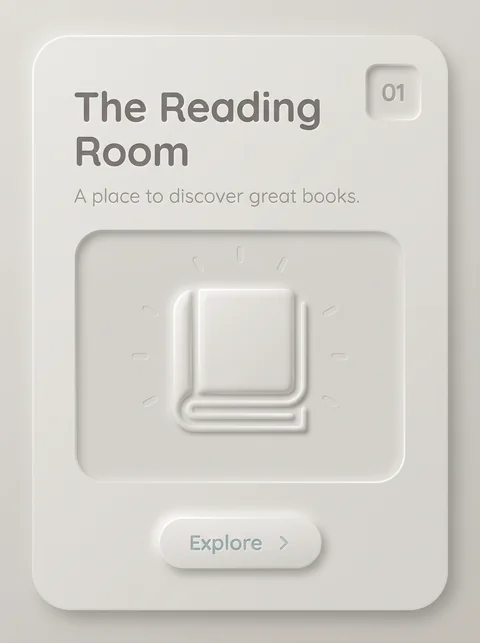
Skeuomorphism imitates real materials like leather and wood; Neumorphism keeps only the soft shadows and drops the materials, leaving a single plain surface.

05 · Texture & Material
Skeuomorphism Leather, wood, metal, and paper textures.
Neumorphism One plain, matte surface.
01 · Color
Skeuomorphism The colors of real materials.
Neumorphism Near-monochrome.
13 · Imagery & Illustration
Skeuomorphism Photorealistic objects.
Neumorphism Simple embossed icons.
20 · Historical & Cultural References
Skeuomorphism Roughly 2007 to 2013, before iOS 7.
Neumorphism Around 2020.
View Neumorphism

Comparisons are drafted from general design history and not yet checked against sources.

The style, layer by layer

Described with the Laboratory's shared vocabulary, from the elements up to digital behavior.

Foundation · fine art

The elements

Color
realistic material driven
Typography
sans serif embossed
Shape & geometry
realistic rounded
Line & borders
stitched beveled
Texture & material
leather wood paper metal
Imagery
photorealistic
Ornamentation
decorative

Graphic design adds

The principles

Layout & grid
centered
Space & density
balanced
Balance
stable
Rhythm
regular
Hierarchy
clear
Contrast
realistic

Web design adds

Digital expression

Dimensionality
skeuomorphic embossed
Motion
physical
Interaction
tactile
Navigation
hierarchical

Across every layer

Mood and personality

physical tactile familiar realistic

Building in this style

Advisory guidance for a web interface. A demonstration may interpret the style differently.

Do

  • Render controls as physical objects: switches, knobs, paper, and leather.
  • Use realistic lighting and shadows.
  • Let materials signal function.
  • Make pressed and released states physically convincing.

Avoid

  • Flat solid fills.
  • Abstract icons.

Working palette

  • #D9CBB0

    Background

  • #2B1E14

    Foreground

  • #3A7BD5

    Primary

  • #8B5A2B

    Secondary

  • #C0C0C0

    Accent

Headings
humanist sans
Body
humanist sans
Corner radius
8px
Borders
stitched bevel

Accessibility

  • Textured surfaces behind text reduce contrast; keep text panels smooth.
  • Realistic controls must still expose proper roles and states to assistive technology.

Responsive behavior

  • Heavy textures cost bandwidth; serve lighter textures on mobile.

Sources

Sources pending. This profile was drafted from general design history and has not yet been checked against primary or scholarly sources.

π