14 · Graphic design movement · Late 1960s to 1980s

New Wave Typography

Also known as Swiss Punk

Experimental, expressive, unconventional

Draft profile · not yet reviewed against sources

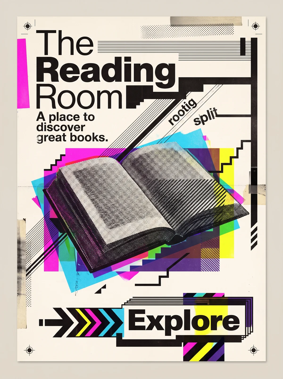
Cream poster with registration marks, tape, and halftone patches. At upper left, "The" in a light black sans-serif, "Reading" in bold, and "Room" in light, stepped down the page. Below, the tagline "A place to discover great books." in bold. A magenta bar at left, black stair-step lines at right, and diagonal line patterns carrying the small rotated words "rootig" and "split". In the center, a halftone open book layered over offset cyan, magenta, yellow, and purple translucent rectangles. At the bottom, a black, yellow, magenta, and cyan chevron arrow points to a boxed "Explore" with stacked outlines, above a diagonally striped block.
The Reading Room in New Wave Typography. An interpretation of the shared “The Reading Room” brief, not a historical work. Supplied by Ryan Grissinger.

Philosophy

Break the rules of Swiss Modernism from inside it. Typography can be intuitive, layered, and expressive while still communicating.

Historical context

Origins
Basel, Switzerland, then the United States.
Period
Late 1960s to 1980s
Influences
Swiss Modernism, Offset lithography, Phototypesetting, Postmodernism
Notable figures
Wolfgang Weingart, April Greiman, Dan Friedman, Willi Kunz

Drafted from general design history. Sources pending.

What the example shows

Observations tied to the taxonomy, including where the example departs from the profile.

  • 02 · Typography

    A clean sans-serif is pushed to extremes: weight and size change within the title, and small words run on diagonals.

  • 06 · Layout & Grid

    The Swiss grid is bent. Lines, stair-steps, and blocks cut across the page and break the order.

  • 13 · Imagery & Illustration

    The book is a halftone image over overprinted translucent color, a Basel-school print technique.

  • 01 · Color

    Bright cyan, magenta, yellow, and purple overprint on cream, and the overlaps make new colors.

  • 04 · Line & Borders

    Heavy rules, line screens, and stair-steps act as structure and decoration at once.

Often confused with

The styles closest to New Wave Typography, and what sets each apart.

Swiss Modernism

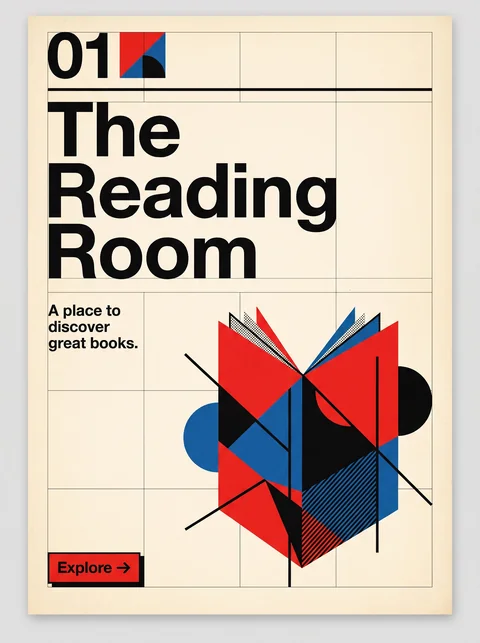
New Wave started from Swiss Modernism and broke it on purpose, with stepped baselines, mixed weights, and layered images where Swiss design keeps strict order.

02 · Typography
New Wave Typography Weight, size, and spacing change within a word or line.
Swiss Modernism Consistent weights and even spacing.
06 · Layout & Grid
New Wave Typography Bent and broken grids, with stair-stepped text.
Swiss Modernism A strict modular grid with flush-left text.
05 · Texture & Material
New Wave Typography Visible halftones, line screens, and overprinting.
Swiss Modernism Clean, flat print surfaces.
19 · Mood & Personality
New Wave Typography Playful, intellectual, and experimental.
Swiss Modernism Calm, rational, and objective.
20 · Historical & Cultural References
New Wave Typography Basel and Los Angeles, late 1970s and 1980s, led by Wolfgang Weingart and April Greiman.
Swiss Modernism Zurich and Basel, 1950s and 1960s.
View Swiss Modernism

Memphis

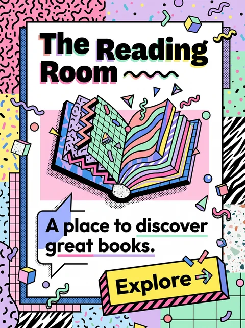
Memphis is about pattern and object, with squiggles, terrazzo, and pastel brights; New Wave is about type, bending the grid with layered sans-serifs and halftones.

14 · Ornamentation
New Wave Typography Little pattern; rules, screens, and blocks instead.
Memphis Squiggles, confetti, and zebra and terrazzo patterns everywhere.
02 · Typography
New Wave Typography Type is the main event.
Memphis Type plays a supporting role.
01 · Color
New Wave Typography Saturated overprinted color with black.
Memphis Clashing pastels and brights.
20 · Historical & Cultural References
New Wave Typography Swiss and Californian typography, late 1970s and 1980s.
Memphis A Milan furniture and product design collective, 1981 to 1987.
View Memphis

Grunge Typography

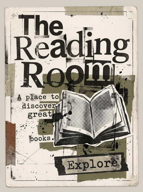
New Wave bends the Swiss grid with control and clean sans-serifs; Grunge tears it up, with distressed type, dirty texture, and deliberate illegibility.

02 · Typography
New Wave Typography Clean sans-serifs varied in weight and spacing.
Grunge Typography Distressed, mixed faces, sometimes unreadable.
05 · Texture & Material
New Wave Typography Crisp halftones and line screens.
Grunge Typography Photocopy grime and scratches.
01 · Color
New Wave Typography Bright, saturated overprints.
Grunge Typography Muted, dirty blacks, rusts, and olives.
20 · Historical & Cultural References
New Wave Typography Late 1970s and 1980s, led by Weingart and Greiman.
Grunge Typography The 1990s, led by David Carson.
View Grunge Typography

Comparisons are drafted from general design history and not yet checked against sources.

The style, layer by layer

Described with the Laboratory's shared vocabulary, from the elements up to digital behavior.

Foundation · fine art

The elements

Color
bright layered contrasting
Typography
expressive mixed weight spaced
Shape & geometry
fragmented geometric
Line & borders
layered stepped
Texture & material
halftone film
Imagery
collaged layered
Ornamentation
decorative

Graphic design adds

The principles

Layout & grid
broken grid layered
Space & density
dense layered
Balance
dynamic
Rhythm
syncopated
Hierarchy
expressive
Contrast
strong

Web design adds

Digital expression

Dimensionality
layered
Motion
kinetic
Interaction
expressive
Navigation
unconventional

Across every layer

Mood and personality

experimental expressive unconventional energetic

Building in this style

Advisory guidance for a web interface. A demonstration may interpret the style differently.

Do

  • Layer type, rules, and halftone imagery.
  • Vary letter spacing and weight within a single line.
  • Start from a grid, then deliberately break it.
  • Use stepped and wavy rules as structure.

Avoid

  • Static, evenly spaced type.
  • Strict single-column grids.

Working palette

  • #F2F0EB

    Background

  • #121212

    Foreground

  • #E8432E

    Primary

  • #2E5BFF

    Secondary

  • #F7C948

    Accent

Headings
grotesque sans
Body
grotesque sans
Corner radius
0px
Borders
layered rules

Accessibility

  • Overlapping type must never obscure navigation or form labels.
  • Preserve a logical reading order in the markup even when the visual order is playful.

Responsive behavior

  • Reduce layering on small screens; keep one expressive headline per view.

Sources

Sources pending. This profile was drafted from general design history and has not yet been checked against primary or scholarly sources.

π