02 · Design movement · 1919–1933

Bauhaus

Also known as Geometric Modernism

Geometric, functional, experimental

Draft profile · not yet reviewed against sources

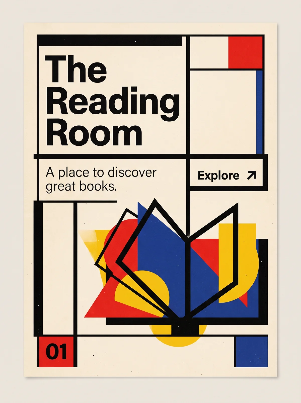
Poster on off-white paper built from heavy black rules that divide it into rectangular fields. Top left, "The Reading Room" in a heavy black sans-serif on three lines. Top right, a red square and a blue vertical bar. Below the title, the tagline "A place to discover great books." in a light sans-serif, beside a bordered button labeled "Explore" with an arrow pointing up and right. The lower half holds an open book drawn as a black outline over overlapping red, blue, and yellow triangles, circles, and rectangles. At bottom left, a red square with the number 01. At bottom right, a blue rectangle.
The Reading Room in Bauhaus. An interpretation of the shared “The Reading Room” brief, not a historical work. Supplied by Ryan Grissinger.

Philosophy

Unite art, craft, and industrial production. Form should follow function, and good design should be available to everyone.

Historical context

Origins
Germany: the Bauhaus school in Weimar, then Dessau and Berlin.
Period
1919–1933
Influences
Arts and Crafts, Deutscher Werkbund, De Stijl, Constructivism
Notable figures
Walter Gropius, László Moholy-Nagy, Herbert Bayer, Josef Albers, Marianne Brandt

Drafted from general design history. Sources pending.

What the example shows

Observations tied to the taxonomy, including where the example departs from the profile.

  • 03 · Shape & Geometry

    Everything reduces to the primary forms: circle, triangle, square. The book is assembled from them.

  • 01 · Color

    Red, yellow, and blue with black on off-white. The three primaries are used flat, as pure fields of color.

  • 02 · Typography

    A single geometric sans-serif in two weights, set flush left with no decoration. Letterforms serve function.

  • 06 · Layout & Grid

    Thick black rules cut the page into asymmetric rectangular fields. The structure is visible and carries the layout.

  • 09 · Balance & Tension

    The layout is asymmetric but balanced: heavy title mass at upper left against the colored image at lower right.

  • 13 · Imagery & Illustration

    The book is a black outline laid over overlapping colored shapes. Image and abstraction are the same thing.

Often confused with

The styles closest to Bauhaus, and what sets each apart.

Swiss Modernism

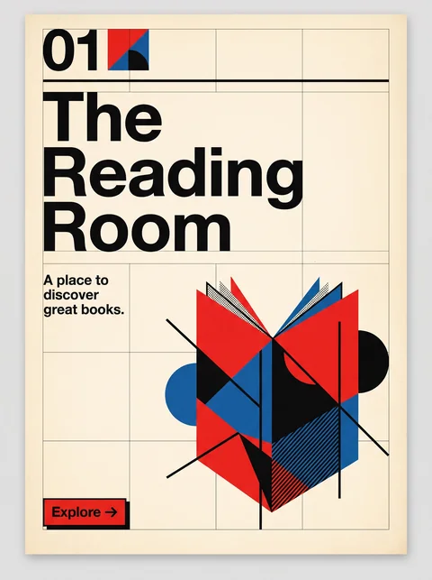
Bauhaus treats color and geometric form as expressive material; Swiss Modernism hands the work to a modular grid and neutral type, and keeps color to a minimum.

01 · Color
Bauhaus Primary red, yellow, and blue used in flat fields.
Swiss Modernism Black and white with one accent, usually red.
02 · Typography
Bauhaus Geometric, constructed letterforms, including lowercase-only experiments.
Swiss Modernism Neutral grotesques such as Akzidenz-Grotesk and Helvetica, set flush left.
06 · Layout & Grid
Bauhaus Blocks, bars, and shapes balanced by eye.
Swiss Modernism A mathematical modular grid governs every element.
13 · Imagery & Illustration
Bauhaus Abstract shapes and photomontage share the page with type.
Swiss Modernism Objective photography or no imagery; type is often the image.
20 · Historical & Cultural References
Bauhaus A German art school, 1919 to 1933, uniting art, craft, and industry.
Swiss Modernism Swiss poster and typography practice of the 1950s and 1960s that systematized earlier modernism.
View Swiss Modernism

Constructivism

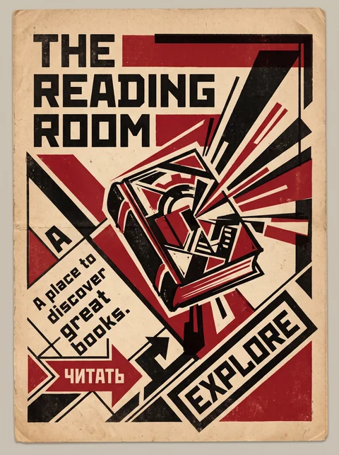
Constructivism uses geometry as political persuasion, with hard diagonals, red and black, and photomontage; Bauhaus uses it to teach good form for everyday life.

01 · Color
Bauhaus Red, yellow, and blue.
Constructivism Red and black on cream, often nothing else.
09 · Balance & Tension
Bauhaus Measured, balanced compositions.
Constructivism Aggressive diagonals that suggest motion and urgency.
13 · Imagery & Illustration
Bauhaus Abstract forms and object photography.
Constructivism Photomontage of workers, crowds, and machines.
19 · Mood & Personality
Bauhaus Rational and educational.
Constructivism Urgent, revolutionary, and persuasive.
20 · Historical & Cultural References
Bauhaus Germany, 1919 to 1933.
Constructivism Soviet Russia, late 1910s to early 1930s.
View Constructivism

De Stijl

Both use primaries and pure geometry, but De Stijl limits itself to horizontals, verticals, and rectangles, while Bauhaus works freely with circles, triangles, and diagonals.

03 · Shape & Geometry
Bauhaus Circle, triangle, and square, plus diagonals.
De Stijl Rectangles only, on horizontals and verticals.
09 · Balance & Tension
Bauhaus Dynamic compositions, often on the diagonal.
De Stijl Asymmetric balance held in static tension.
02 · Typography
Bauhaus Systematic sans-serifs, like Herbert Bayer's universal alphabet.
De Stijl Lettering built from rectangular strokes to match the grid.
13 · Imagery & Illustration
Bauhaus Embraced photography and photomontage.
De Stijl Pure abstraction, with no representational imagery.
20 · Historical & Cultural References
Bauhaus A German school teaching design for industry, 1919 to 1933.
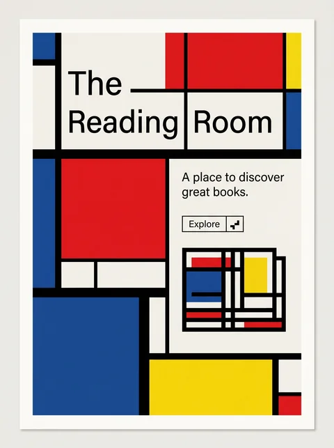
De Stijl A Dutch movement and magazine, 1917 to 1931, led by Mondrian and van Doesburg.
View De Stijl

Comparisons are drafted from general design history and not yet checked against sources.

The style, layer by layer

Described with the Laboratory's shared vocabulary, from the elements up to digital behavior.

Foundation · fine art

The elements

Color
primary bold black
Typography
geometric sans sans serif lowercase
Shape & geometry
geometric circles squares triangles
Line & borders
heavy bars
Texture & material
flat matte
Imagery
abstract photographic geometric
Ornamentation
minimal

Graphic design adds

The principles

Layout & grid
asymmetric modular
Space & density
balanced functional
Balance
dynamic asymmetric
Rhythm
regular structured
Hierarchy
clear functional
Contrast
strong primary

Web design adds

Digital expression

Dimensionality
flat
Motion
mechanical functional
Interaction
direct functional
Navigation
structured

Across every layer

Mood and personality

geometric functional experimental rational

Building in this style

Advisory guidance for a web interface. A demonstration may interpret the style differently.

Do

  • Build the composition from circles, squares, and triangles.
  • Use primary colors with black and white, each with a clear role.
  • Treat typography as a structural element, not decoration.
  • Expose function: a control should look like what it does.

Avoid

  • Decoration that serves no function.
  • Serif and script typefaces.
  • Muted, harmonious palettes that soften the primaries.

Working palette

  • #F4F1EA

    Background

  • #111111

    Foreground

  • #D7261E

    Primary

  • #1D4E9E

    Secondary

  • #F2C500

    Accent

Headings
geometric sans
Body
geometric sans
Corner radius
0px
Borders
heavy solid

Accessibility

  • Yellow on white fails contrast; use yellow only as a fill behind dark text.
  • Geometric sans at small sizes can hurt legibility; keep body text generous.

Responsive behavior

  • Stack geometric blocks vertically on narrow screens instead of shrinking them.

Sources

Sources pending. This profile was drafted from general design history and has not yet been checked against primary or scholarly sources.

π