05 · Graphic design movement · Contemporary, rooted in 20th-century magazine design

Contemporary Editorial Design

Also known as Editorial Design

Literary, sophisticated, typographic

Draft profile · not yet reviewed against sources

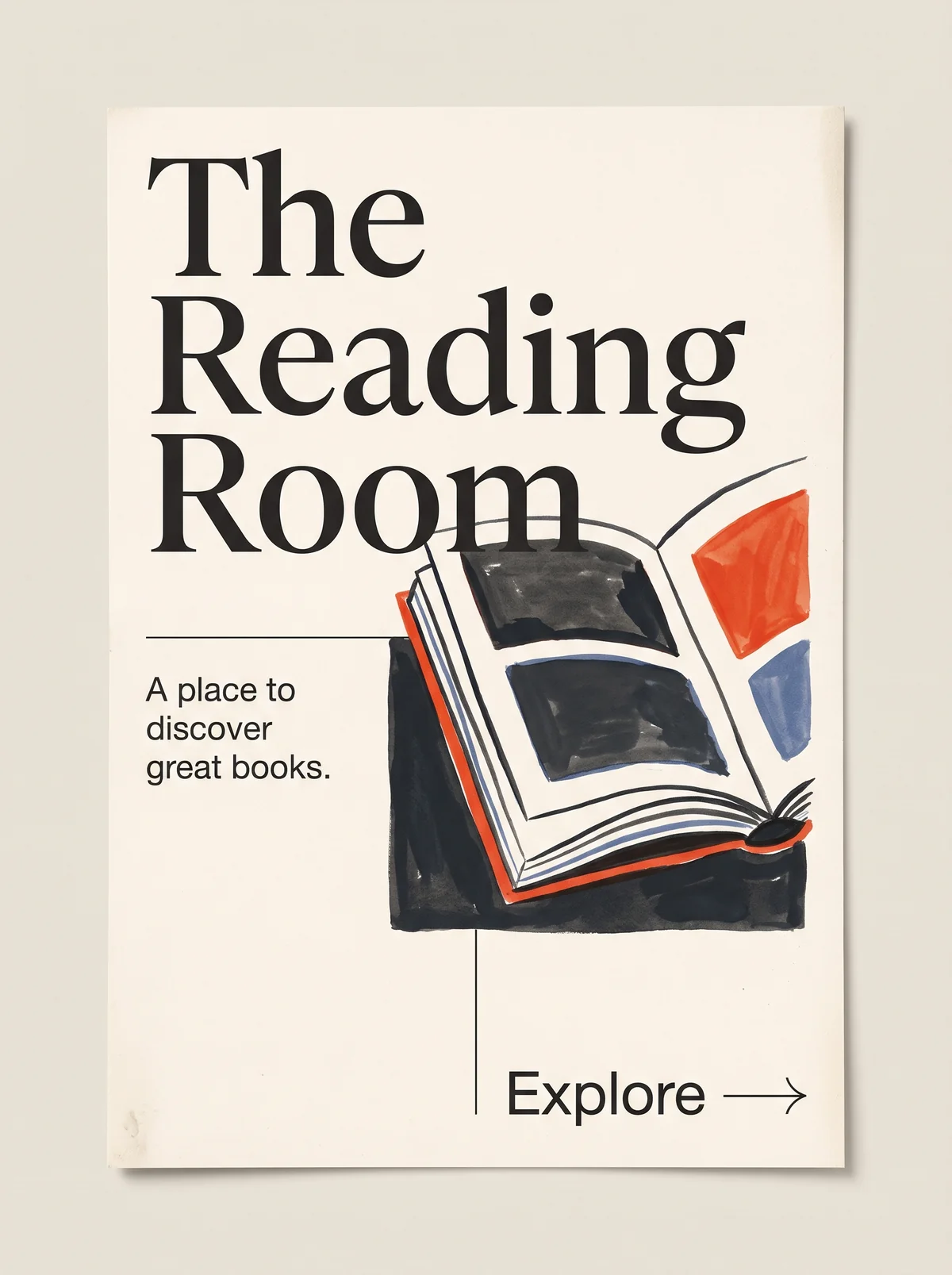
Poster on off-white paper. At upper left, "The Reading Room" in a very large black high-contrast serif on three lines, with the last word, "Room", overlapping the top of a loose, hand-painted illustration of an open book. The book is drawn with ink lines and brush washes in black, orange-red, and blue, set against a dark painted block at right. At left, below a thin horizontal rule, the tagline "A place to discover great books." in a small black sans-serif. At bottom right, beside a thin vertical rule, the word "Explore" in sans-serif followed by a long, thin arrow.
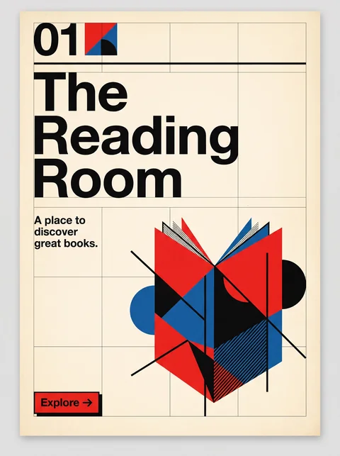
The Reading Room in Contemporary Editorial Design. An interpretation of the shared “The Reading Room” brief, not a historical work. Supplied by Ryan Grissinger.

Philosophy

Typography and pacing serve the reader. A cover or opener establishes authority through dramatic scale, and the pages that follow set tone, hierarchy, and rhythm for sustained reading.

Historical context

Origins
Magazine and newspaper art direction, carried into long-form digital publishing.
Period
Contemporary, rooted in 20th-century magazine design
Influences
Swiss Modernism, Magazine art direction, Book design, Editorial illustration
Notable figures
Alexey Brodovitch, Willy Fleckhaus, Richard Turley, Matt Willey

Drafted from general design history. Some claims are sourced; see Sources below.

What the example shows

Observations tied to the taxonomy, including where the example departs from the profile.

  • 08 · Scale & Proportion

    The headline is enormous and the tagline and Explore are small. The jump in scale sets the hierarchy at a glance, the way a magazine cover does.

  • 02 · Typography

    A high-contrast display serif for the title, with a plain grotesque sans-serif for the tagline and Explore. The serif carries the voice; the sans does the work.

  • 06 · Layout & Grid

    A visible grid of hairline rules divides the page, and it breaks in exactly one place: "Room" overlaps the top of the book. One deliberate break adds tension without losing order.

  • 13 · Imagery & Illustration

    The book is a loose gouache-and-ink editorial illustration, conceptual rather than literal, as if commissioned for a feature. It sits inside the margins rather than bleeding off the page.

  • 07 · Space & Density

    Generous margins and an empty lower left let the headline and illustration breathe. The white space is part of the hierarchy, not leftover room.

  • 01 · Color

    Charcoal ink, orange-red, and muted blue on warm off-white. The profile calls for a single accent; this example uses two, both sparingly, and stays restrained.

  • 17 · Interaction & Feedback

    Explore is set like a table-of-contents cue: a word, a long thin arrow, and a hairline rule beside it. It invites the reader in without looking like a product button.

Often confused with

The styles closest to Contemporary Editorial Design, and what sets each apart.

Swiss Modernism

Swiss Modernism keeps type neutral and the grid absolute; Contemporary Editorial gives the page a voice, with expressive serifs, art-directed images, and a grid it breaks on purpose.

02 · Typography
Contemporary Editorial Design High-contrast display serifs paired with a sans-serif.
Swiss Modernism One neutral grotesque throughout.
06 · Layout & Grid
Contemporary Editorial Design A grid broken once, deliberately.
Swiss Modernism A grid that is never broken.
13 · Imagery & Illustration
Contemporary Editorial Design Commissioned illustration and art-directed photography.
Swiss Modernism Objective photography or none.
19 · Mood & Personality
Contemporary Editorial Design Literary and opinionated.
Swiss Modernism Impersonal and objective.
View Swiss Modernism

Comparisons are drafted from general design history and not yet checked against sources.

The style, layer by layer

Described with the Laboratory's shared vocabulary, from the elements up to digital behavior.

Foundation · fine art

The elements

Color
restrained monochrome single accent
Typography
serif high contrast typographic serif sans pairing
Shape & geometry
rectilinear
Line & borders
hairline ruled
Texture & material
smooth paper
Imagery
art directed photographic illustrated
Ornamentation
restrained

Graphic design adds

The principles

Layout & grid
asymmetric multi column deliberately broken
Space & density
generous paced
Balance
asymmetric considered
Rhythm
progressive
Hierarchy
dramatic typographic
Contrast
tonal deliberate

Web design adds

Digital expression

Dimensionality
flat
Motion
subtle
Interaction
understated
Navigation
editorial linear

Across every layer

Mood and personality

literary sophisticated typographic considered

Building in this style

Advisory guidance for a web interface. A demonstration may interpret the style differently.

Do

  • Lead with a large, high-contrast serif headline, set far above everything else in scale.
  • Build a strict grid, then break it once, on purpose.
  • Pair art-directed photography or commissioned illustration with generous margins.
  • Use pull quotes, drop caps, and rules to pace long reading.
  • Keep line length comfortable for long reading.
  • Set captions, labels, and calls to action in a plain sans-serif beside the serif.
  • Make calls to action read as editorial cues, such as a ruled link with an arrow, not product buttons.

Avoid

  • Dense dashboard layouts.
  • Bright multicolor palettes.
  • Icon-heavy navigation.
  • Product-style buttons.
  • Stock photography and clip-art icons.

Working palette

  • #FBFAF7

    Background

  • #1B1B1B

    Foreground

  • #B3261E

    Primary

  • #5C5C5C

    Secondary

Headings
high contrast serif
Body
text serif
Corner radius
0px
Borders
hairline rule

Accessibility

  • Thin high-contrast serifs can break up at small sizes; use a text cut for body copy.

Responsive behavior

  • Collapse to a single reading column; keep the headline scale dramatic.

Sources

Other claims on this page have not yet been checked against sources.

π