08 · Cultural aesthetic · c. 1997–2004

Y2K Futurism

Also known as Y2K Aesthetic

Glossy, technological, nostalgic

Draft profile · not yet reviewed against sources

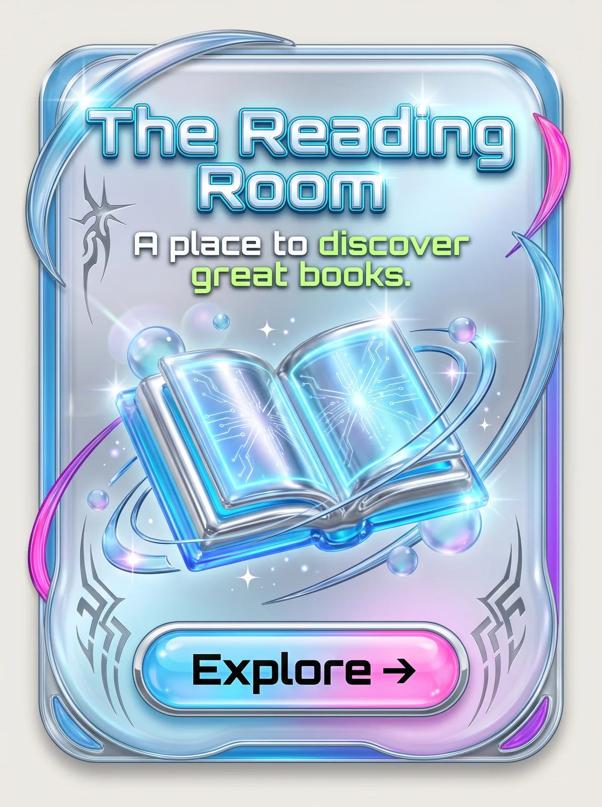
Rounded card in chrome and translucent blue, with liquid-metal swooshes in blue and hot pink, silver tribal ornaments, sparkles, and soap bubbles. At top, "The Reading Room" in glossy chrome-blue techno lettering, with the tagline "A place to discover great books." below in white, with "discover great books." in lime green. In the center, a glassy chrome open book with glowing circuit patterns on its pages, ringed by orbiting bands. At the bottom, a glossy blue-to-pink pill button with a chrome bezel, labeled "Explore" with an arrow in black.
The Reading Room in Y2K Futurism. An interpretation of the shared “The Reading Room” brief, not a historical work. Supplied by Ryan Grissinger.

Philosophy

Excitement about the coming digital millennium, expressed through chrome, translucency, and techno-optimism.

Historical context

Origins
Late-1990s consumer technology, music videos, video games, and fashion.
Period
c. 1997–2004
Influences
Space Age design, Retro-Futurism, Rave culture, Early 3D rendering
Notable figures
The Designers Republic, Jony Ive

Drafted from general design history. Sources pending.

What the example shows

Observations tied to the taxonomy, including where the example departs from the profile.

  • 05 · Texture & Material

    Chrome, liquid metal, and translucent plastic, rendered as if 3D-modeled around 2000.

  • 01 · Color

    Icy blue and silver with hot pink and lime accents, a cool, electric palette.

  • 13 · Imagery & Illustration

    The book is an inflated chrome object with glowing circuit patterns, part book and part device.

  • 14 · Ornamentation

    Tribal motifs, sparkles, lens flares, and swooshes are the decorative vocabulary of the era.

  • 17 · Interaction & Feedback

    The bubble-like pill with a bright highlight and chrome bezel turns the button into a shiny toy.

Often confused with

The styles closest to Y2K Futurism, and what sets each apart.

Vaporwave

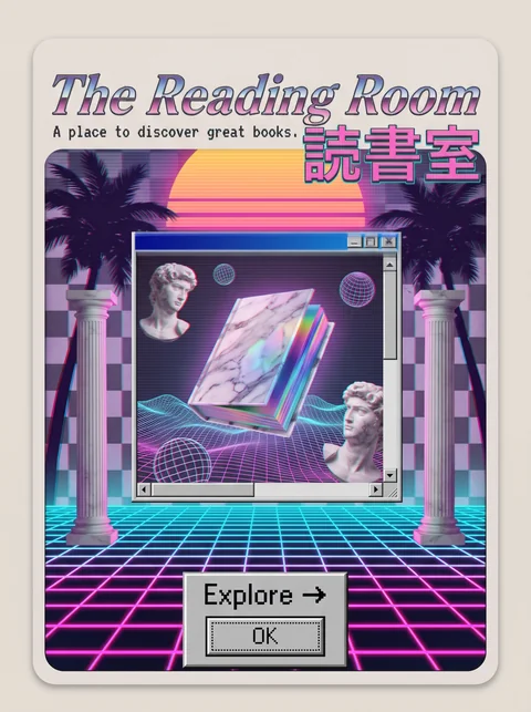
Y2K Futurism was sincerely excited about the new millennium; Vaporwave looks back at that era's technology with irony and nostalgia.

19 · Mood & Personality
Y2K Futurism Sincere and excited.
Vaporwave Ironic and nostalgic.
01 · Color
Y2K Futurism Chrome silver and icy blue.
Vaporwave Pastel pink, cyan, and purple.
13 · Imagery & Illustration
Y2K Futurism Rendered chrome objects and bubbles.
Vaporwave Collaged busts, palms, and old interface windows.
20 · Historical & Cultural References
Y2K Futurism Made around 1998 to 2004, looking forward.
Vaporwave Made in the 2010s, looking back.

View Vaporwave

Frutiger Aero

Both are glossy, but Frutiger Aero is calm and natural, with sky, water, and grass, while Y2K Futurism is synthetic, with chrome, tribal motifs, and electric color.

13 · Imagery & Illustration
Y2K Futurism Chrome blobs, tribal shapes, and sparkles.
Frutiger Aero Sky, water, bubbles, and leaves.
01 · Color
Y2K Futurism Silver, icy blue, hot pink, and lime.
Frutiger Aero Sky blue, aqua, and fresh green.
19 · Mood & Personality
Y2K Futurism Excited and synthetic.
Frutiger Aero Calm and healthy.
20 · Historical & Cultural References
Y2K Futurism Roughly 1998 to 2004.
Frutiger Aero Roughly 2004 to 2013, the Windows Vista and early iPhone era.
View Frutiger Aero

Retro-Futurism

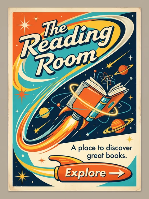
Both picture the future, but Retro-Futurism does it with 1950s rockets and flat illustration, while Y2K Futurism does it with glossy chrome, translucent plastic, and early 3D rendering.

05 · Texture & Material
Y2K Futurism Chrome, liquid metal, and translucent plastic.
Retro-Futurism Flat, printed illustration on aged paper.
15 · Dimensionality
Y2K Futurism Glossy 3D rendering with lens flares.
Retro-Futurism Flat, with simple shading.
01 · Color
Y2K Futurism Icy blue, silver, and hot pink.
Retro-Futurism Warm teal, orange, and cream.
20 · Historical & Cultural References
Y2K Futurism Roughly 1998 to 2004.
Retro-Futurism Imagined in the 1950s and 1960s.
View Retro-Futurism

Comparisons are drafted from general design history and not yet checked against sources.

The style, layer by layer

Described with the Laboratory's shared vocabulary, from the elements up to digital behavior.

Foundation · fine art

The elements

Color
iridescent chrome silver cyan
Typography
techno extended futuristic
Shape & geometry
rounded blobby bubbly
Line & borders
glossy outlined
Texture & material
chrome translucent plastic
Imagery
3d rendered digital
Ornamentation
decorative

Graphic design adds

The principles

Layout & grid
layered fluid
Space & density
layered
Balance
dynamic
Rhythm
kinetic
Hierarchy
dramatic
Contrast
luminous

Web design adds

Digital expression

Dimensionality
sculptural glossy
Motion
kinetic elastic
Interaction
playful tactile
Navigation
spatial exploratory

Across every layer

Mood and personality

glossy technological nostalgic optimistic

Building in this style

Advisory guidance for a web interface. A demonstration may interpret the style differently.

Do

  • Use chrome, iridescence, and translucent plastic as primary materials.
  • Round everything into blobs and pills.
  • Set display type in wide or techno faces.
  • Add glossy highlights to controls so they feel touchable.

Avoid

  • Flat, minimal surfaces.
  • Earthy or muted palettes.
  • Serif typography.

Working palette

  • #EEF1F6

    Background

  • #10131A

    Foreground

  • #4A5CFF

    Primary

  • #9AA3B5

    Secondary

  • #C6FF00

    Accent

Headings
techno extended
Body
geometric sans
Corner radius
18px
Borders
glossy bevel

Accessibility

  • Chrome and iridescent text often fails contrast; keep body text solid.
  • Respect reduced motion for spinning and shimmering effects.

Responsive behavior

  • Keep glossy controls large enough to tap; drop decorative 3D objects first.

Sources

Sources pending. This profile was drafted from general design history and has not yet been checked against primary or scholarly sources.

π