09 · Cultural aesthetic · Rooted in centuries-old traditions; modern graphic expression from the 1950s

Japanese Minimalism

Quiet, intentional, restrained

Draft profile · not yet reviewed against sources

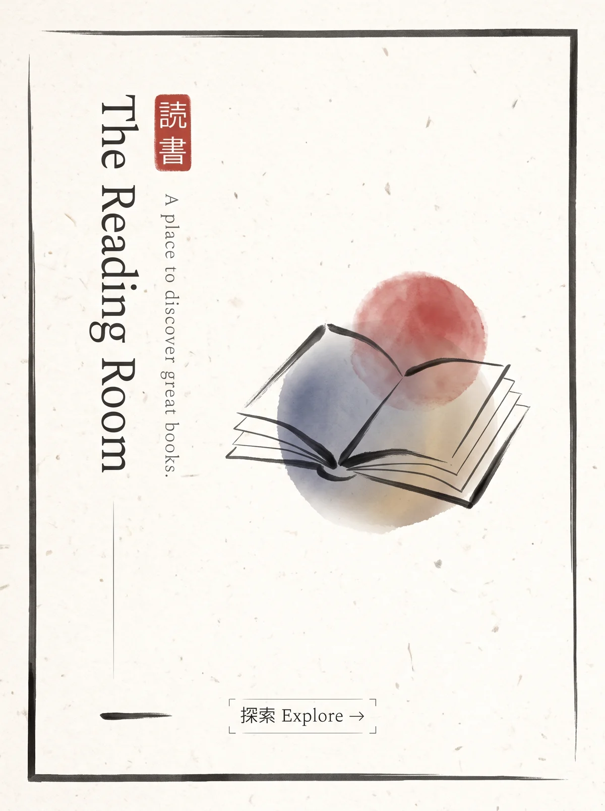
Mostly empty off-white paper poster inside a thin, uneven hand-drawn ink frame. At upper left, a red seal with the characters 読書 (reading). Beside it, "The Reading Room" runs vertically in a light serif, with the tagline "A place to discover great books." running vertically alongside. At center right, an ink-line drawing of an open book over soft watercolor washes of red and blue. Near the bottom, a small bracketed button reads 探索 "Explore" with an arrow.
The Reading Room in Japanese Minimalism. An interpretation of the shared “The Reading Room” brief, not a historical work. Supplied by Ryan Grissinger.

Philosophy

Emptiness is not absence. Restraint, natural materials, and negative space give each element room to be felt.

Historical context

Origins
Japan, drawing on Zen Buddhism, traditional architecture, and the concepts of ma (meaningful space) and wabi-sabi.
Period
Rooted in centuries-old traditions; modern graphic expression from the 1950s
Influences
Zen Buddhism, Wabi-sabi, Traditional Japanese architecture
Notable figures
Kenya Hara, Ikko Tanaka, Tadao Ando

Drafted from general design history. Sources pending.

What the example shows

Observations tied to the taxonomy, including where the example departs from the profile.

  • 07 · Space & Density

    Most of the page is empty. The space around the title and book is what gives them presence.

  • 02 · Typography

    Title and tagline run vertically in a light serif, a structural choice rather than a decorative one.

  • 01 · Color

    Ink black and a single vermilion seal, with soft watercolor washes behind the book.

  • 13 · Imagery & Illustration

    Brush and ink-wash drawing. The profile cautions against literal stereotypes such as brush fonts. Here the brush is confined to the illustration and the type stays restrained, a useful line to study.

  • 20 · Historical & Cultural References

    The seal reads 読書 (reading) and the button adds 探索 (explore).

Often confused with

The styles closest to Japanese Minimalism, and what sets each apart.

Scandinavian Design

Both are calm and spare, but Japanese Minimalism treats emptiness itself as meaningful and leans on asymmetry, while Scandinavian design aims for cozy, everyday comfort.

07 · Space & Density
Japanese Minimalism Emptiness (ma) is an active part of the composition.
Scandinavian Design Space is generous but practical.
09 · Balance & Tension
Japanese Minimalism Asymmetric, with deliberate imbalance.
Scandinavian Design Balanced and often centered.
01 · Color
Japanese Minimalism Natural neutrals with an occasional red or ink black.
Scandinavian Design Soft whites and pale wood with a muted accent.
19 · Mood & Personality
Japanese Minimalism Contemplative and austere.
Scandinavian Design Warm and cozy.
View Scandinavian Design

Comparisons are drafted from general design history and not yet checked against sources.

The style, layer by layer

Described with the Laboratory's shared vocabulary, from the elements up to digital behavior.

Foundation · fine art

The elements

Color
muted natural neutral single accent
Typography
light restrained vertical optional
Shape & geometry
geometric organic
Line & borders
delicate invisible
Texture & material
paper natural matte
Imagery
photographic sparse
Ornamentation
minimal

Graphic design adds

The principles

Layout & grid
asymmetric open
Space & density
expansive sparse
Balance
asymmetric quiet
Rhythm
slow measured
Hierarchy
restrained
Contrast
subtle tonal

Web design adds

Digital expression

Dimensionality
flat
Motion
slow subtle
Interaction
understated
Navigation
linear minimal

Across every layer

Mood and personality

quiet intentional restrained contemplative

Building in this style

Advisory guidance for a web interface. A demonstration may interpret the style differently.

Do

  • Give every element generous surrounding space.
  • Use natural, low-saturation colors with a single vermilion or ink accent.
  • Prefer asymmetric balance to symmetry.
  • Let interactions be slow and quiet.

Avoid

  • Visual clutter.
  • Loud saturated palettes.
  • Literal stereotypes such as cherry blossoms and brush fonts.

Working palette

  • #F7F5F0

    Background

  • #222222

    Foreground

  • #B5332E

    Primary

  • #8A8A80

    Secondary

Headings
light sans
Body
humanist sans
Corner radius
0px
Borders
hairline

Accessibility

  • Light type weights and pale grays drift below contrast minimums; check every text color.
  • Low-visibility controls need clear focus states.

Responsive behavior

  • Preserve the ratio of space to content as screens shrink, not the absolute spacing.

Sources

Sources pending. This profile was drafted from general design history and has not yet been checked against primary or scholarly sources.

π