
07 · Design movement · c. 1945–1969

Mid-Century Modern

Warm, optimistic, approachable

Draft profile · not yet reviewed against sources

Cream poster with offset olive and mustard rules suggesting a frame. "The Reading Room" in cut-paper letters on mustard, orange, and teal blocks, each slightly offset. Boomerangs, starbursts, and leaves in flat cut-paper shapes spill from an open book. Below, the tagline "A place to discover great books." in a friendly black sans-serif. At the bottom, an orange ribbon banner reads "Explore" with a curling arrow.
The Reading Room in Mid-Century Modern. An interpretation of the shared “The Reading Room” brief, not a historical work. Supplied by Ryan Grissinger.

Philosophy

Optimistic, democratic modernism. Good design should be warm, functional, and part of everyday life.

Historical context

Origins
Postwar United States and Europe, especially Scandinavia.
Period
c. 1945–1969
Influences
Bauhaus, Scandinavian Design, International Style architecture
Notable figures
Charles and Ray Eames, George Nelson, Saul Bass, Paul Rand, Alvin Lustig, Alexander Girard

Drafted from general design history. Sources pending.

What the example shows

Observations tied to the taxonomy, including where the example departs from the profile.

  • 02 · Typography

    Cut-paper title letters on colored blocks, each slightly offset, playful but legible.

  • 13 · Imagery & Illustration

    Boomerangs, starbursts, and leaves in flat cut-paper shapes, the period's optimistic motifs.

  • 01 · Color

    Mustard, olive, teal, and orange on warm cream.

  • 06 · Layout & Grid

    Offset rules suggest a frame without closing it, an orderly layout with a loose edge.

  • 19 · Mood & Personality

    Warm and playful on the surface, orderly underneath.

Often confused with

The styles closest to Mid-Century Modern, and what sets each apart.

Scandinavian Design

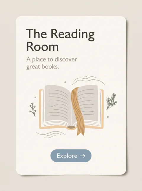
Both are warm and functional, but Mid-Century Modern is playful, with bold color and boomerang shapes, while Scandinavian design is quieter, lighter, and more neutral.

01 · Color
Mid-Century Modern Bold mustard, teal, and orange.
Scandinavian Design Soft whites, grays, and pale wood, with one muted accent.
03 · Shape & Geometry
Mid-Century Modern Boomerangs, atomic starbursts, and organic blobs.
Scandinavian Design Simple, softly rounded forms.
07 · Space & Density
Mid-Century Modern Lively, with pattern and spot illustration.
Scandinavian Design Calm and spacious.
20 · Historical & Cultural References
Mid-Century Modern American and European design, about 1945 to 1969.
Scandinavian Design Nordic design from the 1930s on, widely known from the 1950s.
View Scandinavian Design

Retro-Futurism

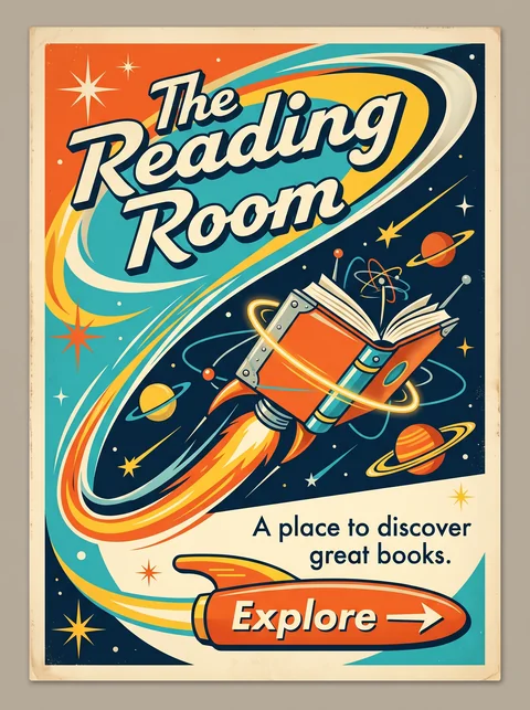
Mid-Century Modern is the everyday design of the 1950s and 1960s; Retro-Futurism is what that era imagined the future would look like, with rockets, orbits, and chrome.

13 · Imagery & Illustration
Mid-Century Modern Furniture, homes, and simple abstract shapes.
Retro-Futurism Rockets, ringed planets, atoms, and flying machines.
01 · Color
Mid-Century Modern Earthy mustard, olive, teal, and orange.
Retro-Futurism Teal, atomic orange, and yellow against deep navy space.
09 · Balance & Tension
Mid-Century Modern Calm, balanced, often asymmetric layouts.
Retro-Futurism Swooping diagonals that suggest speed.
19 · Mood & Personality
Mid-Century Modern Optimistic and domestic.
Retro-Futurism Optimistic and adventurous.
View Retro-Futurism

Comparisons are drafted from general design history and not yet checked against sources.

The style, layer by layer

Described with the Laboratory's shared vocabulary, from the elements up to digital behavior.

Foundation · fine art

The elements

Color
warm earthy mustard teal
Typography
geometric sans playful
Shape & geometry
organic geometric boomerang
Line & borders
simple confident
Texture & material
wood grain matte
Imagery
illustrated abstract cut paper
Ornamentation
restrained

Graphic design adds

The principles

Layout & grid
modular open
Space & density
airy open
Balance
asymmetric balanced
Rhythm
playful regular
Hierarchy
clear friendly
Contrast
moderate

Web design adds

Digital expression

Dimensionality
flat layered
Motion
gentle
Interaction
friendly
Navigation
hierarchical

Across every layer

Mood and personality

warm optimistic approachable playful

Building in this style

Advisory guidance for a web interface. A demonstration may interpret the style differently.

Do

  • Use warm earth tones with one or two confident accents.
  • Cut-paper shapes and simple illustration carry personality.
  • Keep layouts open and uncluttered.
  • Let a single playful element interrupt an orderly grid.

Avoid

  • Cold corporate palettes.
  • Heavy gradients and gloss.
  • Dense information layouts.

Working palette

  • #F5EEDC

    Background

  • #2B2118

    Foreground

  • #D9822B

    Primary

  • #2F6F62

    Secondary

  • #A23E2A

    Accent

Headings
geometric sans
Body
humanist sans
Corner radius
8px
Borders
none

Accessibility

  • Mustard and orange accents fail as text color on cream; use them as fills.

Responsive behavior

  • Keep illustrations as single focal elements rather than shrinking whole scenes.

Sources

Sources pending. This profile was drafted from general design history and has not yet been checked against primary or scholarly sources.

π