
18 · Cultural aesthetic · Imagery of the 1930s–1960s, revived from the 1980s

Retro-Futurism

Also known as Atompunk, Googie

Nostalgic, imaginative, exploratory

Draft profile · not yet reviewed against sources

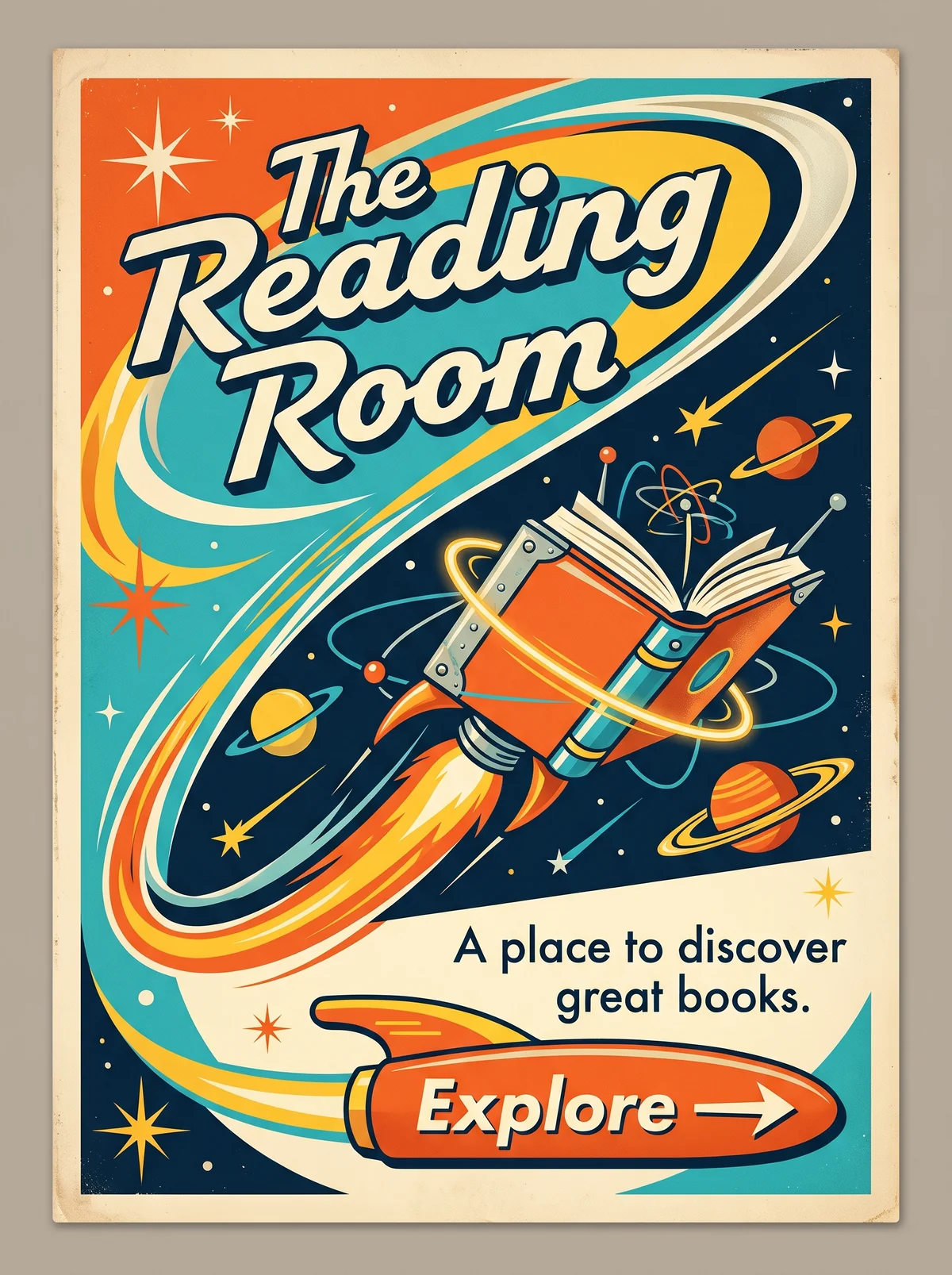
Vintage poster on aged cream paper, with swooping teal, orange, yellow, and navy orbit bands. At upper left, "The Reading Room" in cream italic script with a navy outline and drop shadow. In the center, a rocket made from an orange book with riveted metal brackets, a flame trail, a glowing ring, atom symbols, and ringed planets and stars across a navy sky. At lower right, the tagline "A place to discover great books." in navy sans-serif. Below it, an orange rocket-shaped button labeled "Explore" with an arrow.
The Reading Room in Retro-Futurism. An interpretation of the shared “The Reading Room” brief, not a historical work. Supplied by Ryan Grissinger.

Philosophy

The future as people once imagined it: sleek, atomic, and boundlessly optimistic.

Historical context

Origins
United States Space Age optimism, pulp science fiction, and Googie architecture.
Period
Imagery of the 1930s–1960s, revived from the 1980s
Influences
Streamline Moderne, Googie architecture, Pulp science fiction, Space Age design
Notable figures
Syd Mead, Arthur Radebaugh, Eero Saarinen, John Lautner

Drafted from general design history. Sources pending.

What the example shows

Observations tied to the taxonomy, including where the example departs from the profile.

  • 13 · Imagery & Illustration

    The book is a rocket. Technology and knowledge share one object, with atoms and planets in orbit around it.

  • 01 · Color

    Teal, atomic orange, cream, and sunny yellow on deep navy, the mid-century space-age palette.

  • 02 · Typography

    A jaunty jet-age script for the title, with a clean geometric sans for the tagline.

  • 09 · Balance & Tension

    Sweeping diagonals and curves suggest speed and ascent. The page feels in motion.

  • 19 · Mood & Personality

    The mood is hopeful and a little naive, a mid-century picture of the future as a bright adventure.

Often confused with

The styles closest to Retro-Futurism, and what sets each apart.

Mid-Century Modern

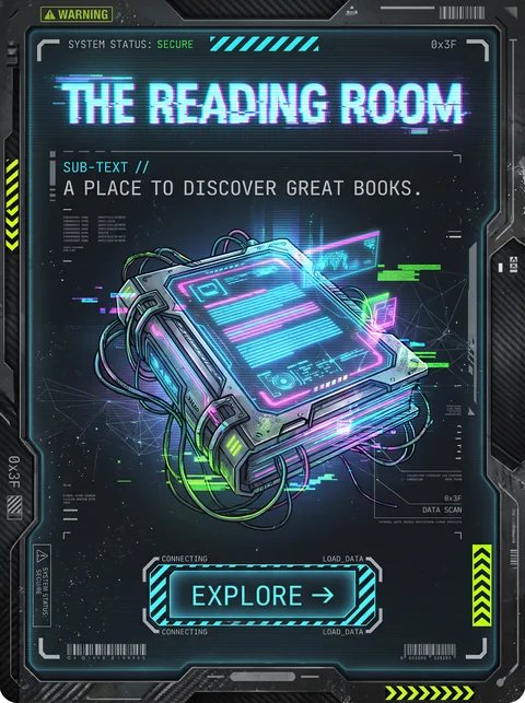
Mid-Century Modern is the everyday design of the 1950s and 1960s; Retro-Futurism is what that era imagined the future would look like, with rockets, orbits, and chrome.

13 · Imagery & Illustration
Retro-Futurism Rockets, ringed planets, atoms, and flying machines.
Mid-Century Modern Furniture, homes, and simple abstract shapes.
01 · Color
Retro-Futurism Teal, atomic orange, and yellow against deep navy space.
Mid-Century Modern Earthy mustard, olive, teal, and orange.
09 · Balance & Tension
Retro-Futurism Swooping diagonals that suggest speed.
Mid-Century Modern Calm, balanced, often asymmetric layouts.
19 · Mood & Personality
Retro-Futurism Optimistic and adventurous.
Mid-Century Modern Optimistic and domestic.
View Mid-Century Modern

Y2K Futurism

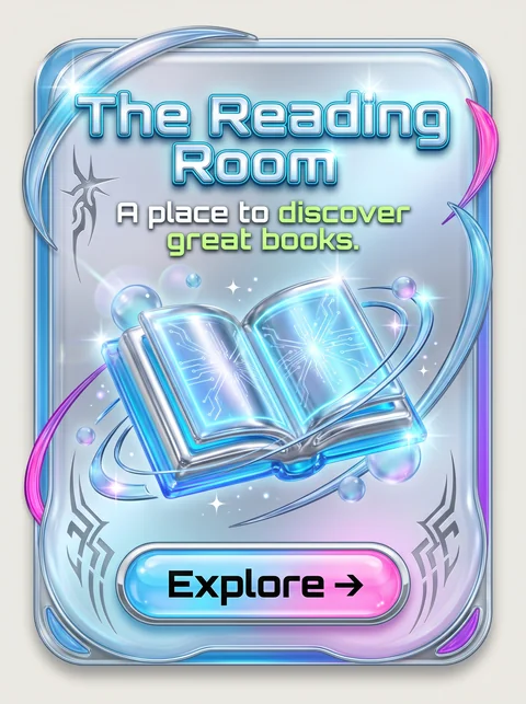
Both picture the future, but Retro-Futurism does it with 1950s rockets and flat illustration, while Y2K Futurism does it with glossy chrome, translucent plastic, and early 3D rendering.

05 · Texture & Material
Retro-Futurism Flat, printed illustration on aged paper.
Y2K Futurism Chrome, liquid metal, and translucent plastic.
15 · Dimensionality
Retro-Futurism Flat, with simple shading.
Y2K Futurism Glossy 3D rendering with lens flares.
01 · Color
Retro-Futurism Warm teal, orange, and cream.
Y2K Futurism Icy blue, silver, and hot pink.
20 · Historical & Cultural References
Retro-Futurism Imagined in the 1950s and 1960s.
Y2K Futurism Roughly 1998 to 2004.
View Y2K Futurism

Cyberpunk

Retro-Futurism imagines a bright, hopeful future; Cyberpunk imagines a dark, crowded one, lit by neon and run by corporations.

19 · Mood & Personality
Retro-Futurism Utopian and a little naive.
Cyberpunk Dystopian and gritty.
01 · Color
Retro-Futurism Teal, orange, and cream daylight colors.
Cyberpunk Neon magenta and cyan on black.
13 · Imagery & Illustration
Retro-Futurism Rockets, planets, and gleaming machines.
Cyberpunk Rain-slick cities, screens, and implants.
20 · Historical & Cultural References
Retro-Futurism The 1950s and 1960s picture of the future.
Cyberpunk 1980s science fiction, from Blade Runner and Neuromancer.
View Cyberpunk

Solarpunk

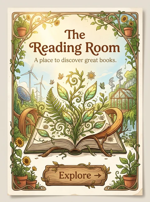
Retro-Futurism dreams of rockets and machines conquering space; Solarpunk dreams of technology living in harmony with nature here on Earth.

13 · Imagery & Illustration
Retro-Futurism Rockets, chrome, and outer space.
Solarpunk Gardens, solar panels, and green cities.
01 · Color
Retro-Futurism Teal, orange, and navy.
Solarpunk Leaf greens, golden yellow, and terracotta.
04 · Line & Borders
Retro-Futurism Smooth streamlines and swooshes.
Solarpunk Organic, vine-like curves.
20 · Historical & Cultural References
Retro-Futurism The 1950s and 1960s picture of the future.
Solarpunk A 2010s and 2020s response to climate change.
View Solarpunk

Comparisons are drafted from general design history and not yet checked against sources.

The style, layer by layer

Described with the Laboratory's shared vocabulary, from the elements up to digital behavior.

Foundation · fine art

The elements

Color
warm retro atomic
Typography
script display rounded sans
Shape & geometry
boomerang starburst rounded
Line & borders
streamlined
Texture & material
chrome enamel
Imagery
illustrated
Ornamentation
decorative

Graphic design adds

The principles

Layout & grid
dynamic layered
Space & density
open
Balance
dynamic
Rhythm
progressive
Hierarchy
dramatic
Contrast
bright

Web design adds

Digital expression

Dimensionality
layered
Motion
smooth swooping
Interaction
playful
Navigation
exploratory

Across every layer

Mood and personality

nostalgic imaginative exploratory optimistic

Building in this style

Advisory guidance for a web interface. A demonstration may interpret the style differently.

Do

  • Use boomerangs, starbursts, and atomic orbits.
  • Streamline shapes with speed lines.
  • Pair rounded display type with a cheerful palette.
  • Illustrate the future rather than photograph it.

Avoid

  • Dystopian darkness.
  • Flat corporate minimalism.

Working palette

  • #F4EAD5

    Background

  • #1C2333

    Foreground

  • #E4572E

    Primary

  • #2E86AB

    Secondary

  • #F2C14E

    Accent

Headings
rounded display
Body
geometric sans
Corner radius
24px
Borders
streamlined trim

Accessibility

  • Script display faces are hard to read; keep them to short headlines.

Responsive behavior

  • Keep one hero illustration; remove secondary starbursts on small screens.

Sources

Sources pending. This profile was drafted from general design history and has not yet been checked against primary or scholarly sources.

π