
15 · Cultural aesthetic · c. 2004–2013 (named retrospectively)

Frutiger Aero

Optimistic, glossy, digital

Draft profile · not yet reviewed against sources

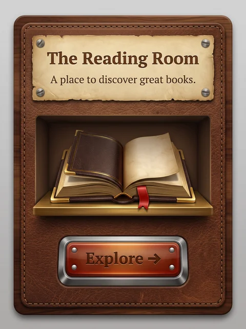
Rounded card with a bright sky-blue background, soft clouds, and light bokeh. Green leaves and grass blur at the bottom, with translucent water ribbons and soap bubbles drifting across. A glossy glass panel with a light border holds the content. At top, "The Reading Room" in white sans-serif with "Reading" in bold, and the tagline "A place to discover great books." beneath it. In the center, a glossy, translucent blue-and-green open book with green seedlings sprouting from its pages, surrounded by sparkles and bubbles. At the bottom, a glossy green pill button labeled "Explore" with a diagonal arrow.
The Reading Room in Frutiger Aero. An interpretation of the shared “The Reading Room” brief, not a historical work. Supplied by Ryan Grissinger.

Philosophy

Clean, eco-optimistic technology: nature and computing in harmony, rendered in glossy, airy blues and greens.

Historical context

Origins
Mid-2000s operating systems and technology advertising; named after the Frutiger typeface and Windows Aero.
Period
c. 2004–2013 (named retrospectively)
Influences
Y2K Futurism, Skeuomorphism, Environmental optimism

Drafted from general design history. Sources pending.

What the example shows

Observations tied to the taxonomy, including where the example departs from the profile.

  • 01 · Color

    Sky blue, aqua, and fresh green. The palette points to clean air, water, and growth.

  • 15 · Dimensionality

    Glossy surfaces, soft highlights, and glassy depth give everything a polished, almost liquid look.

  • 13 · Imagery & Illustration

    A glass book with seedlings growing from it joins technology and nature, the style's core pairing.

  • 17 · Interaction & Feedback

    The Explore control is a glossy Aqua-style pill with a reflective highlight, a clear invitation to press it.

  • 19 · Mood & Personality

    The mood is calm, healthy, and hopeful, typical of mid-2000s optimism about digital life.

Often confused with

The styles closest to Frutiger Aero, and what sets each apart.

Y2K Futurism

Both are glossy, but Frutiger Aero is calm and natural, with sky, water, and grass, while Y2K Futurism is synthetic, with chrome, tribal motifs, and electric color.

13 · Imagery & Illustration
Frutiger Aero Sky, water, bubbles, and leaves.
Y2K Futurism Chrome blobs, tribal shapes, and sparkles.
01 · Color
Frutiger Aero Sky blue, aqua, and fresh green.
Y2K Futurism Silver, icy blue, hot pink, and lime.
19 · Mood & Personality
Frutiger Aero Calm and healthy.
Y2K Futurism Excited and synthetic.
20 · Historical & Cultural References
Frutiger Aero Roughly 2004 to 2013, the Windows Vista and early iPhone era.
Y2K Futurism Roughly 1998 to 2004.
View Y2K Futurism

Glassmorphism

Glassmorphism is flat frosted panels over blurred color; Frutiger Aero is glossy, reflective glass with nature imagery and Aqua-style buttons.

05 · Texture & Material
Frutiger Aero Glossy, reflective surfaces with highlights.
Glassmorphism Matte frosted glass with background blur.
13 · Imagery & Illustration
Frutiger Aero Sky, grass, water, and bubbles.
Glassmorphism Abstract blurred color orbs.
17 · Interaction & Feedback
Frutiger Aero Glossy pill buttons with shine.
Glassmorphism Subtle translucent buttons.
20 · Historical & Cultural References
Frutiger Aero Roughly 2004 to 2013.
Glassmorphism Popular from about 2020, with Apple's Big Sur and later visionOS.
View Glassmorphism

Skeuomorphism

Skeuomorphism makes interfaces look like physical objects; Frutiger Aero makes them look like clean glass floating in nature.

05 · Texture & Material
Frutiger Aero Glossy glass and water.
Skeuomorphism Leather, wood, felt, and brushed metal.
13 · Imagery & Illustration
Frutiger Aero Sky, grass, and bubbles.
Skeuomorphism Real-world objects, like a bookshelf or a notepad.
01 · Color
Frutiger Aero Bright aqua, sky blue, and green.
Skeuomorphism Browns, warm metals, and natural material colors.
19 · Mood & Personality
Frutiger Aero Airy and optimistic.
Skeuomorphism Rich, tactile, and nostalgic.
View Skeuomorphism

Comparisons are drafted from general design history and not yet checked against sources.

The style, layer by layer

Described with the Laboratory's shared vocabulary, from the elements up to digital behavior.

Foundation · fine art

The elements

Color
sky blue grass green bright
Typography
humanist sans clean
Shape & geometry
rounded organic bubbles
Line & borders
glossy highlight
Texture & material
glass water glossy
Imagery
photographic nature bubbles
Ornamentation
decorative

Graphic design adds

The principles

Layout & grid
centered fluid
Space & density
airy
Balance
harmonious
Rhythm
regular
Hierarchy
clear
Contrast
luminous

Web design adds

Digital expression

Dimensionality
layered glossy
Motion
smooth
Interaction
tactile
Navigation
hierarchical

Across every layer

Mood and personality

optimistic glossy digital fresh

Building in this style

Advisory guidance for a web interface. A demonstration may interpret the style differently.

Do

  • Combine sky, water, and grass imagery with glossy UI surfaces.
  • Use humanist sans-serif type throughout.
  • Add soft highlights and reflections to buttons.
  • Keep layouts bright and open.

Avoid

  • Dark or moody palettes.
  • Hard edges and stark contrast.

Working palette

  • #EAF6FF

    Background

  • #0B2A40

    Foreground

  • #1E88E5

    Primary

  • #43A047

    Secondary

  • #7FD6FF

    Accent

Headings
humanist sans
Body
humanist sans
Corner radius
14px
Borders
glossy highlight

Accessibility

  • White text on bright sky blue often fails contrast; check button labels.

Responsive behavior

  • Reduce background imagery to a soft gradient on small screens.

Sources

Sources pending. This profile was drafted from general design history and has not yet been checked against primary or scholarly sources.

π