10 · Cultural aesthetic · 2010 onward

Vaporwave

Also known as Synthwave

Nostalgic, surreal, electronic

Draft profile · not yet reviewed against sources

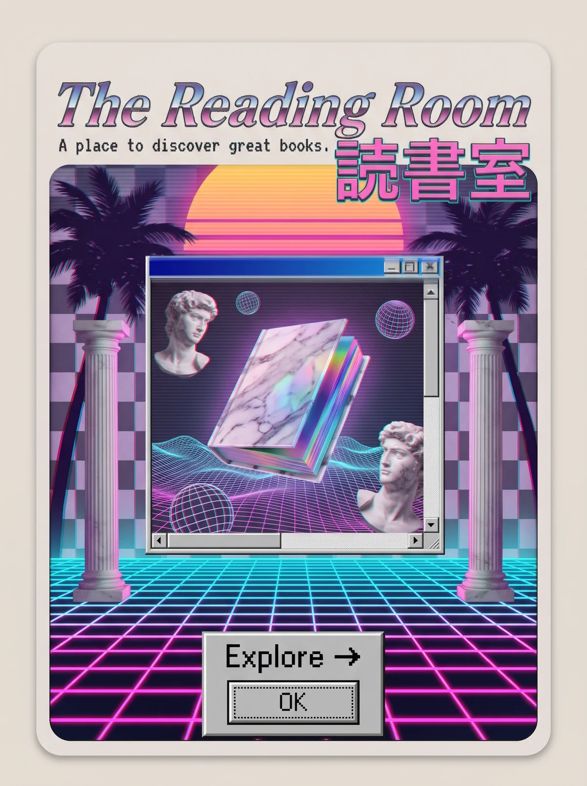
Rounded cream card. At top, "The Reading Room" in chrome pink-and-blue italic lettering, with the tagline "A place to discover great books." in pixelated monospace, and the Japanese characters 読書室 in large pink type at the right. Below, a scene with a striped orange sunset, dark palm trees, a pink and purple checkerboard, marble columns, and a neon grid floor. At the center, a retro operating-system window with a blue title bar and scrollbars, holding a floating marble and holographic book, two marble busts, wireframe spheres, and wireframe terrain. At the bottom, a gray dialog button labeled "Explore" with an arrow, above a smaller button labeled "OK".
The Reading Room in Vaporwave. An interpretation of the shared “The Reading Room” brief, not a historical work. Supplied by Ryan Grissinger.

Philosophy

Ironic, dreamlike nostalgia for 1980s and 1990s consumer culture, corporate design, and the early internet.

Historical context

Origins
Online music micro-genres and internet communities of the early 2010s.
Period
2010 onward
Influences
1980s corporate design, Early web and operating system interfaces, Greco-Roman statuary, 1980s neon

Drafted from general design history. Sources pending.

What the example shows

Observations tied to the taxonomy, including where the example departs from the profile.

  • 20 · Historical & Cultural References

    Greek busts and columns, 1980s sunsets, palm trees, and old operating-system windows stack up into ironic nostalgia.

  • 01 · Color

    Hot pink, cyan, lavender, and purple, with a sunset gradient.

  • 05 · Texture & Material

    Scan lines, slight glitch, and early-3D rendering give a low-resolution, VHS-like surface.

  • 13 · Imagery & Illustration

    The book is a floating marble and holographic object in a fake OS window, a surreal artifact.

  • 17 · Interaction & Feedback

    The button is a gray 1990s system dialog, with an OK button below it. Familiar interface chrome becomes decoration.

Often confused with

The styles closest to Vaporwave, and what sets each apart.

Y2K Futurism

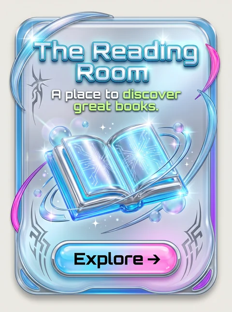
Y2K Futurism was sincerely excited about the new millennium; Vaporwave looks back at that era's technology with irony and nostalgia.

19 · Mood & Personality
Vaporwave Ironic and nostalgic.
Y2K Futurism Sincere and excited.
01 · Color
Vaporwave Pastel pink, cyan, and purple.
Y2K Futurism Chrome silver and icy blue.
13 · Imagery & Illustration
Vaporwave Collaged busts, palms, and old interface windows.
Y2K Futurism Rendered chrome objects and bubbles.
20 · Historical & Cultural References
Vaporwave Made in the 2010s, looking back.
Y2K Futurism Made around 1998 to 2004, looking forward.
View Y2K Futurism

Cyberpunk

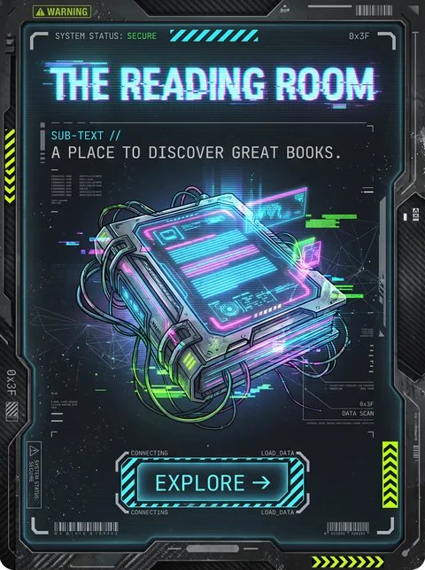
Both glow with neon, but Cyberpunk is a gritty vision of the future, while Vaporwave is an ironic, dreamy nostalgia for 1980s and 1990s consumer culture.

19 · Mood & Personality
Vaporwave Hazy, ironic, and melancholic.
Cyberpunk Tense, dark, and dangerous.
13 · Imagery & Illustration
Vaporwave Greek busts, palm trees, and old operating-system windows.
Cyberpunk Dense cities, rain, and machines.
01 · Color
Vaporwave Pink, cyan, and lavender, with sunset gradients.
Cyberpunk Neon on black.
20 · Historical & Cultural References
Vaporwave A 2010s internet art and music movement.
Cyberpunk 1980s science fiction.
View Cyberpunk

Comparisons are drafted from general design history and not yet checked against sources.

The style, layer by layer

Described with the Laboratory's shared vocabulary, from the elements up to digital behavior.

Foundation · fine art

The elements

Color
pastel neon pink cyan purple
Typography
retro computer serif italic japanese text
Shape & geometry
grid geometric
Line & borders
glowing gridlines
Texture & material
glitch vhs gradient
Imagery
collaged 3d rendered statuary
Ornamentation
decorative

Graphic design adds

The principles

Layout & grid
perspective grid layered
Space & density
layered
Balance
surreal
Rhythm
slow repetitive
Hierarchy
dreamy
Contrast
luminous

Web design adds

Digital expression

Dimensionality
layered
Motion
slow glitch
Interaction
nostalgic
Navigation
exploratory

Across every layer

Mood and personality

nostalgic surreal electronic ironic

Building in this style

Advisory guidance for a web interface. A demonstration may interpret the style differently.

Do

  • Use pink-to-cyan gradients and sunset horizons.
  • Collage classical statues, palm trees, and early computer windows.
  • Mimic old operating system chrome for panels and dialogs.
  • Add scan lines and glitch sparingly.

Avoid

  • Clean corporate minimalism.
  • Earthy natural palettes.

Working palette

  • #1A0B2E

    Background

  • #F4E9FF

    Foreground

  • #FF71CE

    Primary

  • #01CDFE

    Secondary

  • #B967FF

    Accent

  • #FFFB96

    Accent 2

Headings
retro display
Body
monospace
Corner radius
0px
Borders
window chrome

Accessibility

  • Glitch, flicker, and scan-line effects need a reduced-motion alternative.
  • Neon on dark passes for large text but test small text carefully.

Responsive behavior

  • Drop the perspective grid on small screens; keep the gradient.

Sources

Sources pending. This profile was drafted from general design history and has not yet been checked against primary or scholarly sources.

π