
13 · Cultural aesthetic · Mid-2010s onward

Dark Academia

Scholarly, atmospheric, historical

Draft profile · not yet reviewed against sources

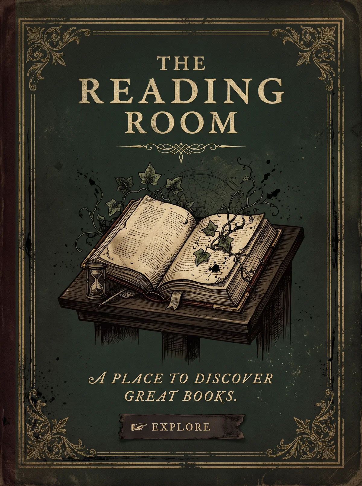
Dark forest-green poster with a worn texture, like an old cloth book cover, with gold corner flourishes. "The Reading Room" in spaced classical serif capitals in aged gold. Below a decorative rule, an engraved-style open book rests on a wooden lectern with ivy and a small hourglass. The tagline "A place to discover great books." is set in gold italic capitals. At the bottom, a small dark ribbon reads "Explore" with a pointing-hand mark.
The Reading Room in Dark Academia. An interpretation of the shared “The Reading Room” brief, not a historical work. Supplied by Ryan Grissinger.

Philosophy

Romanticizes classical education, literature, and old universities: knowledge as a moody, beautiful pursuit.

Historical context

Origins
Online communities on Tumblr, later Instagram and TikTok.
Period
Mid-2010s onward
Influences
Classical and Gothic literature, Oxbridge and Ivy League architecture, The Secret History by Donna Tartt, Dead Poets Society

Drafted from general design history. Sources pending.

What the example shows

Observations tied to the taxonomy, including where the example departs from the profile.

  • 01 · Color

    Deep forest green and aged gold, the colors of an old cloth binding.

  • 02 · Typography

    Spaced classical serif capitals for the title and italic capitals for the tagline.

  • 14 · Ornamentation

    Corner flourishes and a printer's rule frame the page like a title page.

  • 13 · Imagery & Illustration

    An engraved-style book on a lectern, with ivy and an hourglass for atmosphere.

  • 12 · Contrast & Value

    The Explore label is small and low-contrast on a dark ribbon. That is the legibility risk the profile's accessibility notes warn about.

Often confused with

The styles closest to Dark Academia, and what sets each apart.

Victorian

Victorian design is a historical print style; Dark Academia is a late-2010s online aesthetic that borrows the look of old libraries and universities to set a moody, scholarly tone.

01 · Color
Dark Academia Dark browns, deep greens, and candlelit shadow.
Victorian Rich, varied chromolithographic color on cream.
14 · Ornamentation
Dark Academia Restrained; mood comes from imagery and texture.
Victorian Ornament fills every space.
13 · Imagery & Illustration
Dark Academia Moody photography of books, stone, and tweed.
Victorian Engraved illustration.
19 · Mood & Personality
Dark Academia Melancholic and introspective.
Victorian Confident and showy.
20 · Historical & Cultural References
Dark Academia An internet aesthetic from the late 2010s.
Victorian Britain, 1837 to 1901.
View Victorian

Comparisons are drafted from general design history and not yet checked against sources.

The style, layer by layer

Described with the Laboratory's shared vocabulary, from the elements up to digital behavior.

Foundation · fine art

The elements

Color
deep earthy muted
Typography
classical serif
Shape & geometry
traditional rectilinear
Line & borders
fine ruled ornamental
Texture & material
paper leather tweed
Imagery
engraved photographic
Ornamentation
decorative

Graphic design adds

The principles

Layout & grid
formal symmetrical
Space & density
dense layered
Balance
stable formal
Rhythm
measured
Hierarchy
traditional
Contrast
moody

Web design adds

Digital expression

Dimensionality
layered textured
Motion
slow
Interaction
understated
Navigation
hierarchical

Across every layer

Mood and personality

scholarly atmospheric historical moody

Building in this style

Advisory guidance for a web interface. A demonstration may interpret the style differently.

Do

  • Use parchment, leather, and ink tones.
  • Set everything in classical serifs with small caps and italics.
  • Frame sections with fine rules and printer's ornaments.
  • Let pages feel like well-used books.

Avoid

  • Bright saturated colors.
  • Sans-serif display type.
  • Glossy digital surfaces.

Working palette

  • #EDE3D1

    Background

  • #2A1F17

    Foreground

  • #6B2B2B

    Primary

  • #3E4A3D

    Secondary

  • #8C6A3F

    Accent

Headings
old style serif
Body
old style serif
Corner radius
2px
Borders
fine rule

Accessibility

  • Paper textures behind text reduce contrast; keep textures subtle.
  • Moody dark variants need careful contrast checks.

Responsive behavior

  • Drop decorative rules before reducing type size.

Sources

Sources pending. This profile was drafted from general design history and has not yet been checked against primary or scholarly sources.

π