29 · Graphic design movement · c. 1990–2000

Grunge Typography

Also known as Deconstructivism

Raw, expressive, rebellious

Draft profile · not yet reviewed against sources

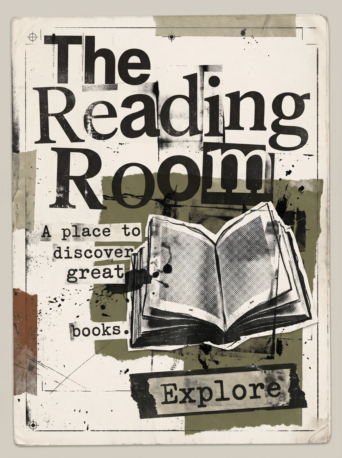
Off-white photocopied paper with registration marks, tape strips, ink splatters, and torn blocks of olive and rust. "The Reading Room" in huge black serif capitals and lowercase, smeared, cropped, and overprinted, with the last letter of "Room" boxed and overlapping. The tagline "A place to discover great books." is broken across typewriter-style strips scattered down the left side. At the right, a cut-out halftone photocopy of an open book. At the bottom right, "Explore" in typewriter type on a taped paper label.
The Reading Room in Grunge Typography. An interpretation of the shared “The Reading Room” brief, not a historical work. Supplied by Ryan Grissinger.

Philosophy

Question legibility itself. Type can be felt and interpreted, and the reader can do some work.

Historical context

Origins
The United States and Britain, through music magazines and design schools such as Cranbrook.
Period
c. 1990–2000
Influences
New Wave Typography, Punk zines, Deconstruction, Early digital type tools
Notable figures
David Carson, Neville Brody, Katherine McCoy, Elliott Earls

Drafted from general design history. Sources pending.

What the example shows

Observations tied to the taxonomy, including where the example departs from the profile.

  • 02 · Typography

    Type is expressive and rough: mixed typefaces, smeared and cropped letterforms, and overlap, in the spirit of David Carson.

  • 05 · Texture & Material

    Photocopy grain, ink splatter, torn paper, and tape give a worn, handmade surface.

  • 06 · Layout & Grid

    The grid is broken on purpose. Words and image collide and the tagline scatters.

  • 01 · Color

    A muted, dirty palette of black, off-white, olive, and rust.

  • 13 · Imagery & Illustration

    The book is a halftone, xeroxed cut-out pasted on top, like a collage.

Often confused with

The styles closest to Grunge Typography, and what sets each apart.

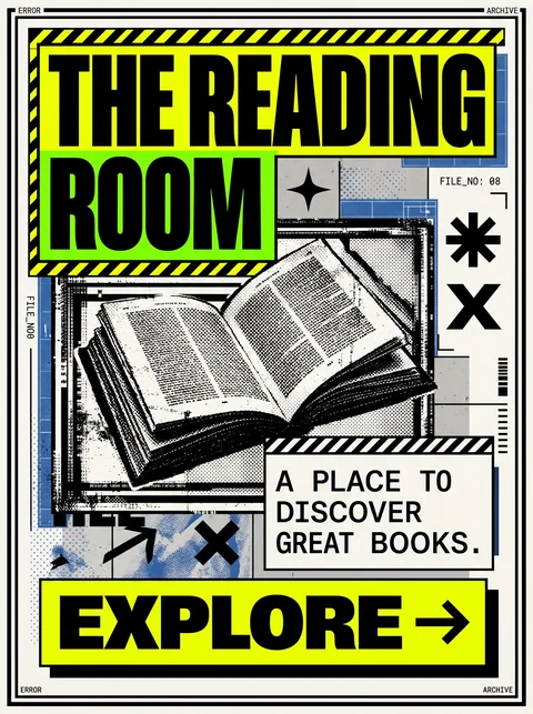
Brutalism

Both look raw, but Brutalism is blunt and structural, exposing the system, while Grunge Typography is expressive and distressed, treating type as emotion.

02 · Typography
Grunge Typography Mixed, distorted, and degraded faces.
Brutalism Default system fonts and monospace, used plainly.
05 · Texture & Material
Grunge Typography Grain, scratches, tape, and photocopy wear.
Brutalism Flat, unprocessed surfaces.
06 · Layout & Grid
Grunge Typography A broken grid with collisions and overlaps.
Brutalism Rigid blocks and visible structure.
20 · Historical & Cultural References
Grunge Typography 1990s print, led by David Carson and Ray Gun magazine.
Brutalism A web design trend of the 2010s.
View Brutalism

New Wave Typography

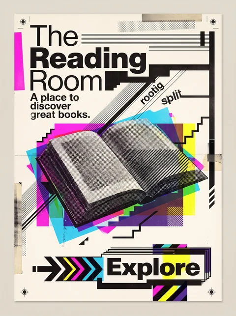
New Wave bends the Swiss grid with control and clean sans-serifs; Grunge tears it up, with distressed type, dirty texture, and deliberate illegibility.

02 · Typography
Grunge Typography Distressed, mixed faces, sometimes unreadable.
New Wave Typography Clean sans-serifs varied in weight and spacing.
05 · Texture & Material
Grunge Typography Photocopy grime and scratches.
New Wave Typography Crisp halftones and line screens.
01 · Color
Grunge Typography Muted, dirty blacks, rusts, and olives.
New Wave Typography Bright, saturated overprints.
20 · Historical & Cultural References
Grunge Typography The 1990s, led by David Carson.
New Wave Typography Late 1970s and 1980s, led by Weingart and Greiman.
View New Wave Typography

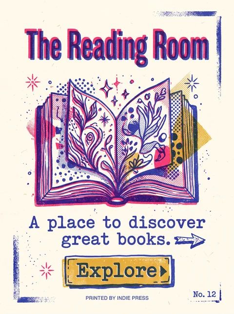
Risograph

Both look printed by hand, but Risograph is bright and cheerful, with misregistered spot colors, while Grunge is dark, distressed, and confrontational.

01 · Color
Grunge Typography Muted blacks and dirty neutrals.
Risograph Bright fluorescent pink, blue, and yellow spot inks.
05 · Texture & Material
Grunge Typography Scratches, grime, and photocopy wear.
Risograph Soft grain and slight misregistration between ink layers.
02 · Typography
Grunge Typography Distorted and mixed type.
Risograph Clean type, often bold and friendly.
19 · Mood & Personality
Grunge Typography Angry and rebellious.
Risograph Playful and indie.
View Risograph

Comparisons are drafted from general design history and not yet checked against sources.

The style, layer by layer

Described with the Laboratory's shared vocabulary, from the elements up to digital behavior.

Foundation · fine art

The elements

Color
muted dirty high contrast
Typography
distressed mixed experimental
Shape & geometry
fragmented irregular
Line & borders
broken scratched
Texture & material
grainy photocopied
Imagery
photographic distressed collaged
Ornamentation
decorative

Graphic design adds

The principles

Layout & grid
broken grid overlapping
Space & density
dense
Balance
deliberately unbalanced
Rhythm
chaotic
Hierarchy
expressive
Contrast
stark

Web design adds

Digital expression

Dimensionality
layered
Motion
jittery
Interaction
expressive
Navigation
unconventional

Across every layer

Mood and personality

raw expressive rebellious anarchic

Building in this style

Advisory guidance for a web interface. A demonstration may interpret the style differently.

Do

  • Layer, crop, and overlap type and images.
  • Use distressed, mixed, and degraded typefaces.
  • Break alignment on purpose.
  • Keep critical content readable in a separate, calmer layer.

Avoid

  • Clean grids.
  • Polished, even type.

Working palette

  • #EDEAE3

    Background

  • #141414

    Foreground

  • #C1272D

    Primary

  • #4A4A4A

    Secondary

  • #9C8F6E

    Accent

Headings
distressed display
Body
grotesque sans
Corner radius
0px
Borders
torn irregular

Accessibility

  • Illegible type must be decorative only; every piece of content needs a readable form.
  • Keep the markup order logical regardless of the visual chaos.

Responsive behavior

  • Let collage elements crop off-screen rather than shrinking them.

Sources

Sources pending. This profile was drafted from general design history and has not yet been checked against primary or scholarly sources.

π