
03 · Design movement · 1981–1988

Memphis

Also known as 1980s Postmodernism, Memphis Group

Playful, rebellious, colorful

Draft profile · not yet reviewed against sources

Busy pastel poster covered in squiggles, confetti, cubes, triangles, and zebra and terrazzo patterns in pink, mint, lilac, and yellow. A white panel with a thick black outline holds "The Reading Room" in a heavy rounded black sans-serif with a squiggle underline. An open book has pages patterned with stripes, grids, and waves. The tagline "A place to discover great books." sits in a speech bubble. A tilted yellow 3D button with black stripes reads "Explore" with an arrow.
The Reading Room in Memphis. An interpretation of the shared “The Reading Room” brief, not a historical work. Supplied by Ryan Grissinger.

Philosophy

Reject modernist restraint and conventional good taste. Design can be playful, provocative, and deliberately kitsch.

Historical context

Origins
Milan, Italy: the Memphis Group, a design collective led by Ettore Sottsass.
Period
1981–1988
Influences
Pop Art, Art Deco, Radical design, Studio Alchimia, Kitsch
Notable figures
Ettore Sottsass, Michele De Lucchi, Nathalie Du Pasquier, George Sowden, Martine Bedin, Peter Shire

Drafted from general design history. Sources pending.

What the example shows

Observations tied to the taxonomy, including where the example departs from the profile.

  • 01 · Color

    Clashing pastels and brights on purpose: pink, mint, lilac, and yellow.

  • 14 · Ornamentation

    Squiggles, confetti, cubes, and zebra and terrazzo patterns fill every margin. Ornament is the composition.

  • 04 · Line & Borders

    Thick black outlines hold the chaos together and keep the content readable.

  • 09 · Balance & Tension

    Panels tilt and overlap. The button is a slab set at an angle, deliberately unbalanced.

  • 15 · Dimensionality

    Hard offset shadows give flat shapes a toy-like depth.

Often confused with

The styles closest to Memphis, and what sets each apart.

New Wave Typography

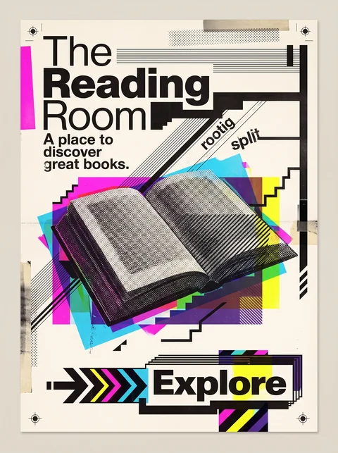
Memphis is about pattern and object, with squiggles, terrazzo, and pastel brights; New Wave is about type, bending the grid with layered sans-serifs and halftones.

14 · Ornamentation
Memphis Squiggles, confetti, and zebra and terrazzo patterns everywhere.
New Wave Typography Little pattern; rules, screens, and blocks instead.
02 · Typography
Memphis Type plays a supporting role.
New Wave Typography Type is the main event.
01 · Color
Memphis Clashing pastels and brights.
New Wave Typography Saturated overprinted color with black.
20 · Historical & Cultural References
Memphis A Milan furniture and product design collective, 1981 to 1987.
New Wave Typography Swiss and Californian typography, late 1970s and 1980s.
View New Wave Typography

Pop Art

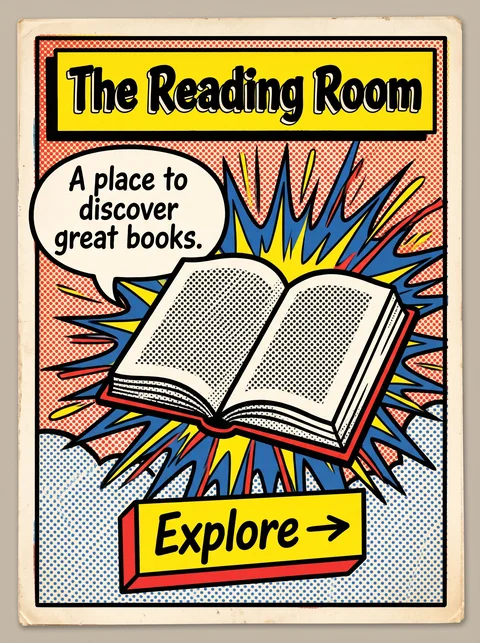
Pop Art borrows from comics and advertising, with halftone dots and thick outlines; Memphis builds its own playful language of squiggles, patterns, and clashing pastels.

14 · Ornamentation
Memphis Abstract squiggles and patterns.
Pop Art Comic speech bubbles, bursts, and Ben-Day dots.
01 · Color
Memphis Pastels mixed with brights.
Pop Art Flat primary red, yellow, and blue.
13 · Imagery & Illustration
Memphis Abstract geometric objects.
Pop Art Everyday consumer goods and comic characters.
20 · Historical & Cultural References
Memphis A design collective in Milan in the 1980s.
Pop Art Fine art of the 1950s and 1960s, led by Warhol and Lichtenstein.
View Pop Art

Comparisons are drafted from general design history and not yet checked against sources.

The style, layer by layer

Described with the Laboratory's shared vocabulary, from the elements up to digital behavior.

Foundation · fine art

The elements

Color
loud contrasting saturated clashing
Typography
expressive playful geometric
Shape & geometry
irregular geometric squiggles
Line & borders
heavy patterned
Texture & material
flat patterned laminate
Imagery
abstract geometric patterned
Ornamentation
decorative maximalist

Graphic design adds

The principles

Layout & grid
asymmetric broken grid
Space & density
dense layered
Balance
deliberately unbalanced dynamic
Rhythm
syncopated
Hierarchy
dramatic playful
Contrast
strong clashing

Web design adds

Digital expression

Dimensionality
flat layered
Motion
playful elastic
Interaction
playful expressive
Navigation
exploratory

Across every layer

Mood and personality

playful rebellious colorful irreverent

Building in this style

Advisory guidance for a web interface. A demonstration may interpret the style differently.

Do

  • Combine clashing colors and patterns on purpose.
  • Scatter geometric shapes, squiggles, and confetti as composition, not garnish.
  • Use thick black outlines to hold the chaos together.
  • Let each section break the rhythm of the last.

Avoid

  • Muted or harmonious palettes.
  • Rigid symmetric grids.
  • Subtle, corporate restraint.

Working palette

  • #FFF8EC

    Background

  • #1A1A1A

    Foreground

  • #FF4F9A

    Primary

  • #00A6A6

    Secondary

  • #FFD23F

    Accent

  • #3B3BFF

    Accent 2

Headings
geometric display
Body
geometric sans
Corner radius
12px
Borders
heavy outline

Accessibility

  • Patterned backgrounds behind text destroy legibility; keep text on solid fills.
  • Offer a reduced-motion mode for bouncing or wiggling elements.

Responsive behavior

  • Reduce the number of floating shapes on small screens; keep the color.

Sources

Sources pending. This profile was drafted from general design history and has not yet been checked against primary or scholarly sources.

π