
16 · Design movement · c. 1930–1970, internationally known from the 1950s

Scandinavian Design

Also known as Nordic Design

Soft, calm, functional

Draft profile · not yet reviewed against sources

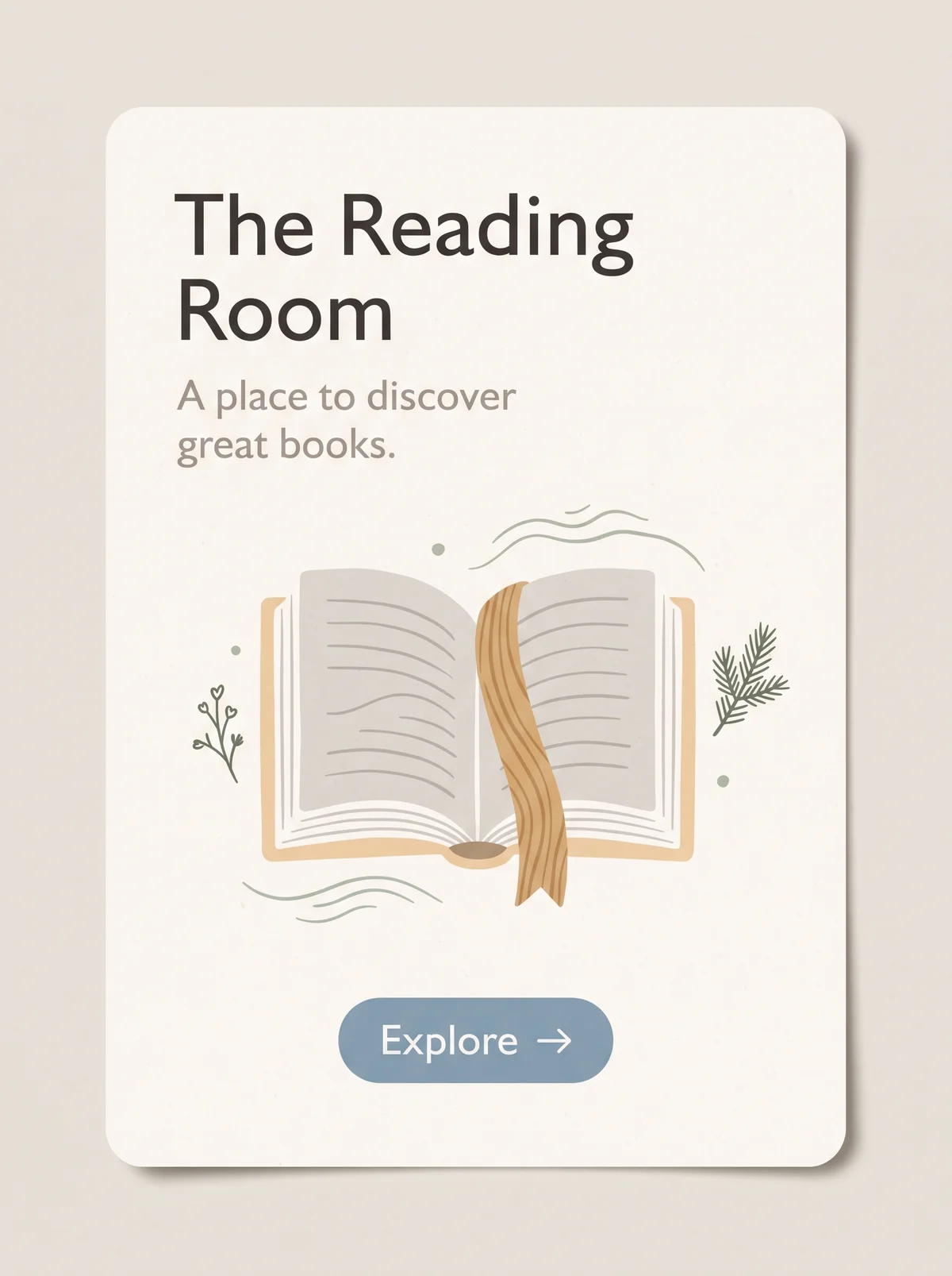
Off-white rounded card on a warm gray-beige ground. At upper left, "The Reading Room" in dark humanist sans-serif on two lines, with the tagline "A place to discover great books." in warm gray beneath. In the middle, an open book with pale gray pages and a light wood-colored cover, a wood-grain ribbon bookmark, small sage-green sprigs, and wavy lines. At the bottom, a dusty-blue pill button labeled "Explore" with an arrow.
The Reading Room in Scandinavian Design. An interpretation of the shared “The Reading Room” brief, not a historical work. Supplied by Ryan Grissinger.

Philosophy

Democratic design: functional, affordable, and beautiful objects for everyday life, made with natural materials and light.

Historical context

Origins
Denmark, Sweden, Norway, Finland, and Iceland.
Period
c. 1930–1970, internationally known from the 1950s
Influences
Functionalism, Craft traditions, Bauhaus
Notable figures
Alvar Aalto, Arne Jacobsen, Hans Wegner, Finn Juhl, Maija Isola, Kaj Franck

Drafted from general design history. Sources pending.

What the example shows

Observations tied to the taxonomy, including where the example departs from the profile.

  • 07 · Space & Density

    Generous, calm negative space around every element. Nothing is crowded.

  • 01 · Color

    Soft whites and warm grays with restrained accents: sage green, light wood, and dusty blue.

  • 05 · Texture & Material

    Natural materials show up as wood grain on the bookmark and a soft paper surface.

  • 02 · Typography

    A warm, friendly humanist sans-serif with good spacing, easy to read.

  • 17 · Interaction & Feedback

    The button is modest and clear, a quiet dusty-blue pill, with no demand for attention.

Often confused with

The styles closest to Scandinavian Design, and what sets each apart.

Mid-Century Modern

Both are warm and functional, but Mid-Century Modern is playful, with bold color and boomerang shapes, while Scandinavian design is quieter, lighter, and more neutral.

01 · Color
Scandinavian Design Soft whites, grays, and pale wood, with one muted accent.
Mid-Century Modern Bold mustard, teal, and orange.
03 · Shape & Geometry
Scandinavian Design Simple, softly rounded forms.
Mid-Century Modern Boomerangs, atomic starbursts, and organic blobs.
07 · Space & Density
Scandinavian Design Calm and spacious.
Mid-Century Modern Lively, with pattern and spot illustration.
20 · Historical & Cultural References
Scandinavian Design Nordic design from the 1930s on, widely known from the 1950s.
Mid-Century Modern American and European design, about 1945 to 1969.
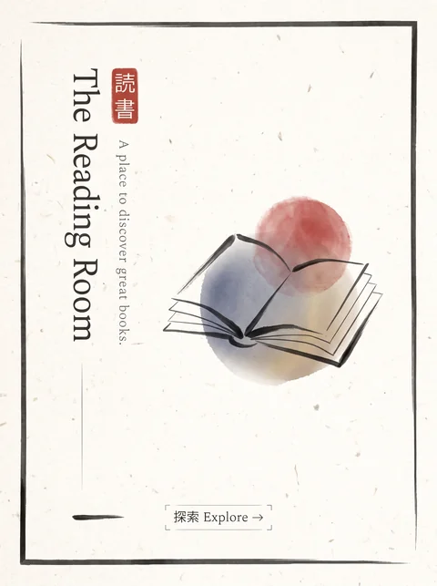
View Mid-Century Modern

Japanese Minimalism

Both are calm and spare, but Japanese Minimalism treats emptiness itself as meaningful and leans on asymmetry, while Scandinavian design aims for cozy, everyday comfort.

07 · Space & Density
Scandinavian Design Space is generous but practical.
Japanese Minimalism Emptiness (ma) is an active part of the composition.
09 · Balance & Tension
Scandinavian Design Balanced and often centered.
Japanese Minimalism Asymmetric, with deliberate imbalance.
01 · Color
Scandinavian Design Soft whites and pale wood with a muted accent.
Japanese Minimalism Natural neutrals with an occasional red or ink black.
19 · Mood & Personality
Scandinavian Design Warm and cozy.
Japanese Minimalism Contemplative and austere.
View Japanese Minimalism

Comparisons are drafted from general design history and not yet checked against sources.

The style, layer by layer

Described with the Laboratory's shared vocabulary, from the elements up to digital behavior.

Foundation · fine art

The elements

Color
soft neutral muted
Typography
humanist sans light
Shape & geometry
rounded organic
Line & borders
soft minimal
Texture & material
wood linen natural
Imagery
photographic natural
Ornamentation
minimal

Graphic design adds

The principles

Layout & grid
simple open
Space & density
airy
Balance
calm balanced
Rhythm
regular
Hierarchy
gentle
Contrast
soft

Web design adds

Digital expression

Dimensionality
flat soft
Motion
gentle
Interaction
calm
Navigation
hierarchical

Across every layer

Mood and personality

soft calm functional cozy

Building in this style

Advisory guidance for a web interface. A demonstration may interpret the style differently.

Do

  • Use soft neutrals with muted natural accents.
  • Favor rounded corners and natural textures.
  • Keep layouts calm and spacious.
  • Make function obvious and quiet.

Avoid

  • Loud or neon color.
  • Heavy ornament.
  • Dense layouts.

Working palette

  • #F6F4F0

    Background

  • #2C2C2A

    Foreground

  • #3F6E8C

    Primary

  • #A8B5A2

    Secondary

  • #D9A38F

    Accent

Headings
humanist sans
Body
humanist sans
Corner radius
8px
Borders
soft hairline

Accessibility

  • Soft palettes drift toward low contrast; keep text dark.

Responsive behavior

  • Calm layouts reflow naturally; keep spacing proportional.

Sources

Sources pending. This profile was drafted from general design history and has not yet been checked against primary or scholarly sources.

π