24 · Interface treatment · 2020 onward

Glassmorphism

Also known as Frosted Glass UI

Translucent, layered, futuristic

Draft profile · not yet reviewed against sources

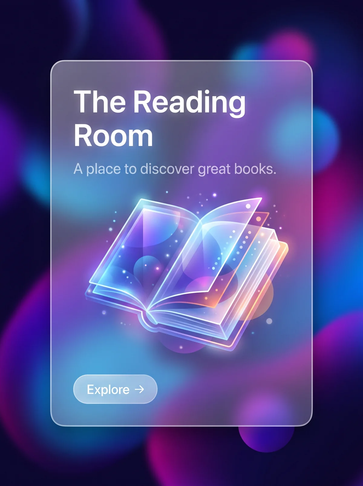
Dark navy backdrop filled with large blurred, glowing orbs in violet, magenta, and blue. A frosted translucent glass panel with a thin light border sits in the center. At upper left inside the panel, "The Reading Room" in white sans-serif on two lines, then the tagline "A place to discover great books." in pale lavender. In the middle, a luminous, translucent open book drawn with light edges and tiny sparkles. At lower left, a translucent pill button labeled "Explore" with an arrow.
The Reading Room in Glassmorphism. An interpretation of the shared “The Reading Room” brief, not a historical work. Supplied by Ryan Grissinger.

Philosophy

Layered translucency gives depth and context, letting what lies beneath show through frosted panels.

Historical context

Origins
Operating system interfaces: Windows Vista Aero glass, iOS 7 blur, Microsoft Fluent acrylic, and macOS Big Sur.
Period
2020 onward
Influences
Frutiger Aero, Flat Design, Operating system translucency

Drafted from general design history. Sources pending.

What the example shows

Observations tied to the taxonomy, including where the example departs from the profile.

  • 15 · Dimensionality

    Depth comes from layers: a frosted panel floats over blurred color. Nothing is solid.

  • 01 · Color

    Vivid violet, magenta, and blue orbs behind the glass make the blur visible and give the panel its color.

  • 05 · Texture & Material

    The frosted texture comes from strong background blur and a thin, semi-transparent light border.

  • 12 · Contrast & Value

    White type holds its contrast against the blur, but the tagline is dimmer and shows the style's legibility tradeoff.

  • 17 · Interaction & Feedback

    The button is a subtle translucent pill. It reads as part of the glass, not as a separate object.

Often confused with

The styles closest to Glassmorphism, and what sets each apart.

Frutiger Aero

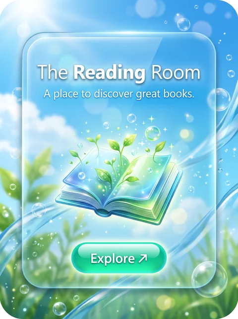
Glassmorphism is flat frosted panels over blurred color; Frutiger Aero is glossy, reflective glass with nature imagery and Aqua-style buttons.

05 · Texture & Material
Glassmorphism Matte frosted glass with background blur.
Frutiger Aero Glossy, reflective surfaces with highlights.
13 · Imagery & Illustration
Glassmorphism Abstract blurred color orbs.
Frutiger Aero Sky, grass, water, and bubbles.
17 · Interaction & Feedback
Glassmorphism Subtle translucent buttons.
Frutiger Aero Glossy pill buttons with shine.
20 · Historical & Cultural References
Glassmorphism Popular from about 2020, with Apple's Big Sur and later visionOS.
Frutiger Aero Roughly 2004 to 2013.
View Frutiger Aero

Neumorphism

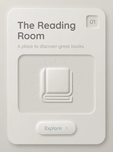
Both are soft 2020s interface treatments, but Glassmorphism gets depth from translucency and blur, while Neumorphism gets it from light and shadow on one opaque surface.

15 · Dimensionality
Glassmorphism Layered translucent panels.
Neumorphism Shapes extruded from, or pressed into, one surface.
01 · Color
Glassmorphism Vivid color behind the glass.
Neumorphism One matte, near-monochrome color.
05 · Texture & Material
Glassmorphism Frosted blur.
Neumorphism Smooth, matte, and opaque.
12 · Contrast & Value
Glassmorphism Usable contrast, though text over blur can suffer.
Neumorphism Low contrast by nature, a known accessibility problem.
View Neumorphism

Comparisons are drafted from general design history and not yet checked against sources.

The style, layer by layer

Described with the Laboratory's shared vocabulary, from the elements up to digital behavior.

Foundation · fine art

The elements

Color
vivid gradient translucent
Typography
sans serif clean
Shape & geometry
rounded
Line & borders
translucent hairline
Texture & material
frosted glass
Imagery
abstract gradient
Ornamentation
minimal

Graphic design adds

The principles

Layout & grid
layered
Space & density
airy layered
Balance
balanced
Rhythm
regular
Hierarchy
clear
Contrast
luminous

Web design adds

Digital expression

Dimensionality
layered translucent
Motion
smooth
Interaction
understated
Navigation
hierarchical

Across every layer

Mood and personality

translucent layered futuristic airy

Building in this style

Advisory guidance for a web interface. A demonstration may interpret the style differently.

Do

  • Place frosted, translucent panels over vivid backgrounds.
  • Give panels a thin, light border to define edges.
  • Use depth through layering, not shadow alone.
  • Keep content inside panels simple.

Avoid

  • Busy photographic backgrounds behind text.
  • Opaque heavy panels.

Working palette

  • #141A33

    Background

  • #F5F7FF

    Foreground

  • #7C5CFF

    Primary

  • #2EC5FF

    Secondary

  • #FF7AC6

    Accent

Headings
geometric sans
Body
geometric sans
Corner radius
20px
Borders
translucent hairline

Accessibility

  • Text contrast depends on what is behind the glass; guarantee contrast with an opaque fallback.
  • Provide a reduced-transparency mode.

Responsive behavior

  • Background blur is costly on low-end devices; reduce layers on mobile.

Sources

Sources pending. This profile was drafted from general design history and has not yet been checked against primary or scholarly sources.

π