23 · Interface treatment · 2019 onward

Neumorphism

Also known as Soft UI

Soft, tactile, dimensional

Draft profile · not yet reviewed against sources

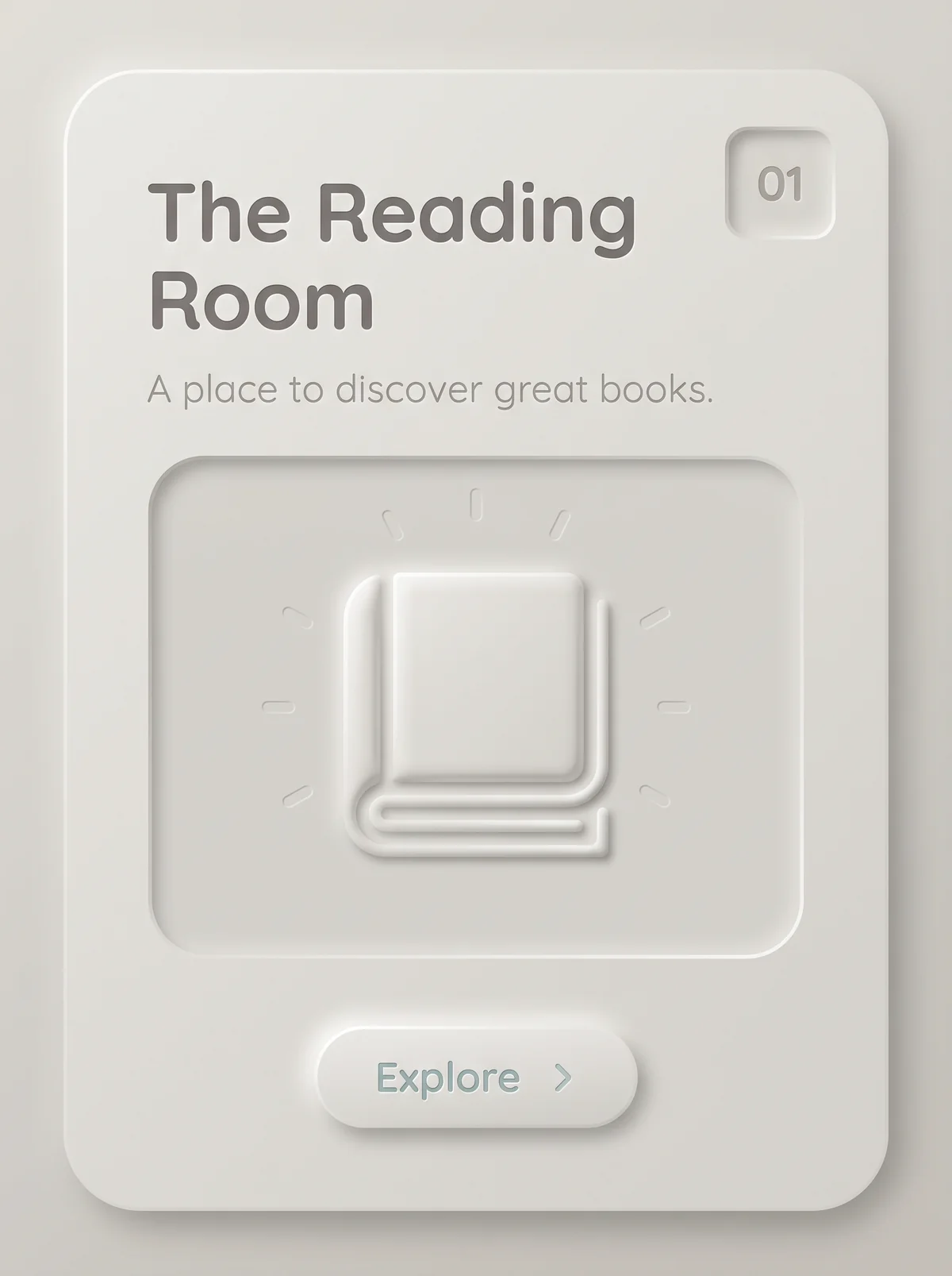
Soft off-white card with large rounded corners on a matching pale gray ground. At upper left, "The Reading Room" debossed in mid-gray rounded sans-serif on two lines, with the tagline "A place to discover great books." in a lighter gray beneath. At upper right, a small inset square containing "01". In the middle, a large inset panel holding an embossed book icon with faint dashes radiating around it. At the bottom, a raised pill button labeled "Explore" with a chevron, in muted blue-gray text.
The Reading Room in Neumorphism. An interpretation of the shared “The Reading Room” brief, not a historical work. Supplied by Ryan Grissinger.

Philosophy

Controls extruded from the same soft material as the background, between flat and skeuomorphic design.

Historical context

Origins
Digital design communities, popularized by concept work shared on Dribbble in late 2019.
Period
2019 onward
Influences
Skeuomorphism, Flat Design
Notable figures
Alexander Plyuto, Michal Malewicz

Drafted from general design history. Sources pending.

What the example shows

Observations tied to the taxonomy, including where the example departs from the profile.

  • 15 · Dimensionality

    Paired light and dark shadows make shapes look pushed out of, or pressed into, one continuous surface.

  • 01 · Color

    A single matte, near-monochrome surface with one muted blue-gray accent on the button.

  • 03 · Shape & Geometry

    Generous rounded corners everywhere, with no hard outlines.

  • 12 · Contrast & Value

    Contrast is low by design. The title stays readable, but the tagline and icon fade into the surface.

  • 17 · Interaction & Feedback

    The raised button invites a press, and the inset panel and square show the pressed state.

Often confused with

The styles closest to Neumorphism, and what sets each apart.

Glassmorphism

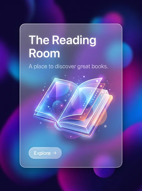
Both are soft 2020s interface treatments, but Glassmorphism gets depth from translucency and blur, while Neumorphism gets it from light and shadow on one opaque surface.

15 · Dimensionality
Neumorphism Shapes extruded from, or pressed into, one surface.
Glassmorphism Layered translucent panels.
01 · Color
Neumorphism One matte, near-monochrome color.
Glassmorphism Vivid color behind the glass.
05 · Texture & Material
Neumorphism Smooth, matte, and opaque.
Glassmorphism Frosted blur.
12 · Contrast & Value
Neumorphism Low contrast by nature, a known accessibility problem.
Glassmorphism Usable contrast, though text over blur can suffer.
View Glassmorphism

Skeuomorphism

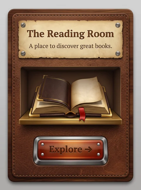
Skeuomorphism imitates real materials like leather and wood; Neumorphism keeps only the soft shadows and drops the materials, leaving a single plain surface.

05 · Texture & Material
Neumorphism One plain, matte surface.
Skeuomorphism Leather, wood, metal, and paper textures.
01 · Color
Neumorphism Near-monochrome.
Skeuomorphism The colors of real materials.
13 · Imagery & Illustration
Neumorphism Simple embossed icons.
Skeuomorphism Photorealistic objects.
20 · Historical & Cultural References
Neumorphism Around 2020.
Skeuomorphism Roughly 2007 to 2013, before iOS 7.
View Skeuomorphism

Comparisons are drafted from general design history and not yet checked against sources.

The style, layer by layer

Described with the Laboratory's shared vocabulary, from the elements up to digital behavior.

Foundation · fine art

The elements

Color
monochromatic soft low saturation
Typography
sans serif rounded
Shape & geometry
rounded soft
Line & borders
invisible
Texture & material
soft extruded
Imagery
minimal iconographic
Ornamentation
minimal

Graphic design adds

The principles

Layout & grid
centered
Space & density
airy
Balance
balanced
Rhythm
regular
Hierarchy
subtle
Contrast
low

Web design adds

Digital expression

Dimensionality
embossed extruded
Motion
soft
Interaction
tactile
Navigation
hierarchical

Across every layer

Mood and personality

soft tactile dimensional calm

Building in this style

Advisory guidance for a web interface. A demonstration may interpret the style differently.

Do

  • Make background and controls the same color.
  • Shape controls with a light highlight and a dark shadow.
  • Show pressed state as an inset shadow.
  • Keep shapes rounded and soft.

Avoid

  • Borders and outlines.
  • Multiple background colors.

Working palette

  • #E6E9EF

    Background

  • #2F3542

    Foreground

  • #5B7CFA

    Primary

  • #A3B1C6

    Secondary

  • #FFFFFF

    Shadow light

  • #A3B1C6

    Shadow dark

Headings
rounded sans
Body
humanist sans
Corner radius
16px
Borders
none

Accessibility

  • Low contrast between controls and background is this style's core weakness; add a visible accent or border for focus and state.
  • Do not rely on shadows alone to show what is clickable.

Responsive behavior

  • Keep shadow distances proportional to control size.

Sources

Sources pending. This profile was drafted from general design history and has not yet been checked against primary or scholarly sources.

π