25 · Cultural aesthetic · Machine introduced 1986; indie print revival from the 2000s

Risograph

Also known as Indie Print

Textured, artistic, imperfect

Draft profile · not yet reviewed against sources

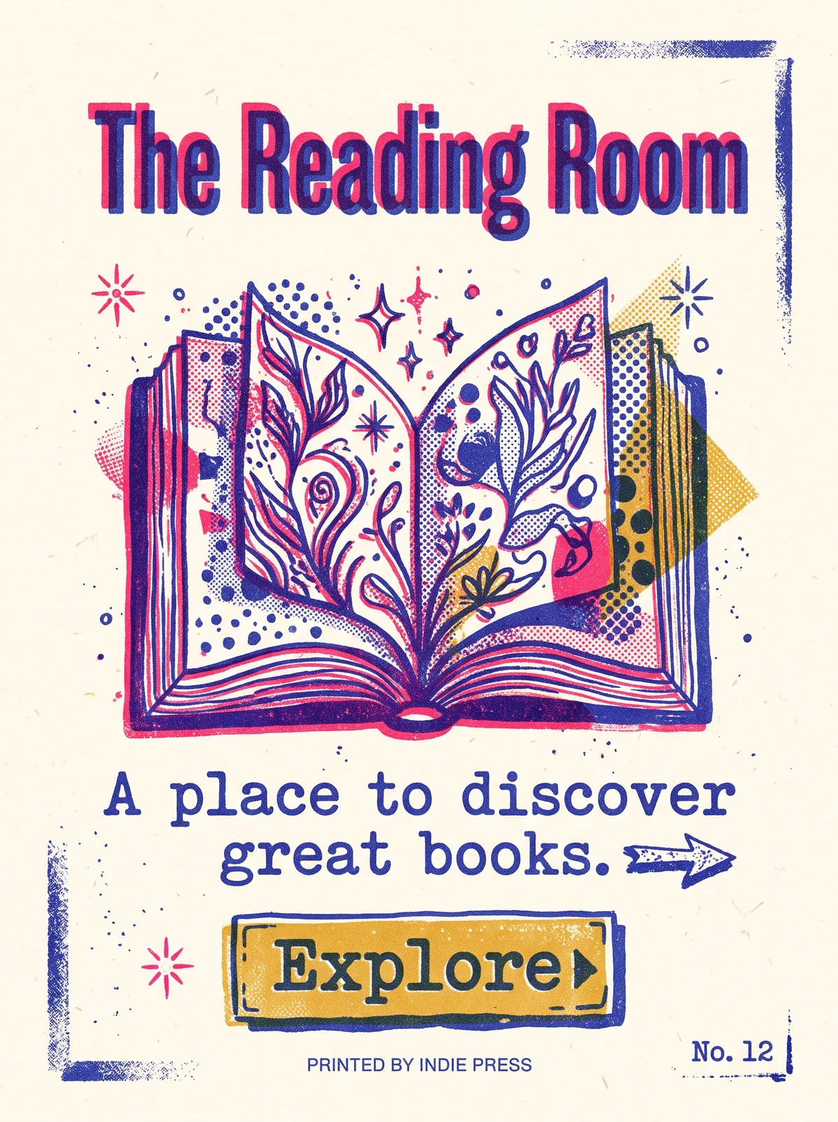
Cream paper poster printed in fluorescent pink, blue, and mustard ink with visible grain and misaligned layers. "The Reading Room" in bold condensed type, printed twice in pink and blue slightly out of register. In the center, a hand-drawn open book full of plants, flowers, stars, and halftone dots. Below, "A place to discover great books." in a blue typewriter-style serif with a hand-drawn arrow. A mustard button with a dashed border reads "Explore". Rough ink corner marks frame the page, and the bottom reads "Printed by Indie Press" and "No. 12".
The Reading Room in Risograph. An interpretation of the shared “The Reading Room” brief, not a historical work. Supplied by Ryan Grissinger.

Philosophy

Embrace the imperfect print. Limited spot inks, grain, and misregistration are character, not defects.

Historical context

Origins
Japan, where the Riso Kagaku Corporation introduced the Risograph; adopted by zine and small-press culture.
Period
Machine introduced 1986; indie print revival from the 2000s
Influences
Zine culture, Screen printing, Independent publishing

Drafted from general design history. Sources pending.

What the example shows

Observations tied to the taxonomy, including where the example departs from the profile.

  • 01 · Color

    Three spot inks only: fluorescent pink, blue, and mustard. Where they overlap, new colors appear.

  • 05 · Texture & Material

    Paper grain, speckle, and slightly misregistered layers are the point, not a flaw.

  • 02 · Typography

    The title is printed twice, pink under blue, slightly offset. The tagline uses a typewriter serif.

  • 13 · Imagery & Illustration

    Hand-drawn illustration with halftone dot fills, the way riso printers build tone.

  • 20 · Historical & Cultural References

    "Printed by Indie Press" and "No. 12" nod to zine culture, where riso found its audience.

Often confused with

The styles closest to Risograph, and what sets each apart.

Pop Art

Both use visible dots and bright ink, but Pop Art imitates mass-market comics and ads, while Risograph comes from small-run indie printing with soft, misregistered spot colors.

05 · Texture & Material
Risograph Grainy texture and misregistered layers.
Pop Art Even, deliberate Ben-Day dots.
01 · Color
Risograph Fluorescent pink and other spot-ink colors.
Pop Art Primary red, yellow, and blue.
04 · Line & Borders
Risograph Often no outlines; shapes are built from ink layers.
Pop Art Thick black outlines.
19 · Mood & Personality
Risograph Handmade and indie.
Pop Art Loud and ironic.
View Pop Art

Grunge Typography

Both look printed by hand, but Risograph is bright and cheerful, with misregistered spot colors, while Grunge is dark, distressed, and confrontational.

01 · Color
Risograph Bright fluorescent pink, blue, and yellow spot inks.
Grunge Typography Muted blacks and dirty neutrals.
05 · Texture & Material
Risograph Soft grain and slight misregistration between ink layers.
Grunge Typography Scratches, grime, and photocopy wear.
02 · Typography
Risograph Clean type, often bold and friendly.
Grunge Typography Distorted and mixed type.
19 · Mood & Personality
Risograph Playful and indie.
Grunge Typography Angry and rebellious.
View Grunge Typography

Comparisons are drafted from general design history and not yet checked against sources.

The style, layer by layer

Described with the Laboratory's shared vocabulary, from the elements up to digital behavior.

Foundation · fine art

The elements

Color
fluorescent spot color overprint
Typography
grotesque sans bold
Shape & geometry
irregular
Line & borders
rough
Texture & material
grainy paper
Imagery
illustrated halftone
Ornamentation
restrained

Graphic design adds

The principles

Layout & grid
modular loose
Space & density
balanced
Balance
casual
Rhythm
irregular
Hierarchy
bold
Contrast
strong

Web design adds

Digital expression

Dimensionality
flat textured
Motion
minimal
Interaction
playful
Navigation
linear

Across every layer

Mood and personality

textured artistic imperfect indie

Building in this style

Advisory guidance for a web interface. A demonstration may interpret the style differently.

Do

  • Limit the palette to two or three spot inks.
  • Overlap inks to create new colors through overprinting.
  • Add grain and slight misregistration.
  • Use bold grotesque type.

Avoid

  • Smooth gradients.
  • Full-color photography.
  • Glossy surfaces.

Working palette

  • #F7F1E3

    Background

  • #1A1A1A

    Foreground

  • #FF48B0

    Primary

  • #0078BF

    Secondary

  • #FFE800

    Accent

Headings
grotesque sans
Body
grotesque sans
Corner radius
0px
Borders
misregistered

Accessibility

  • Fluorescent pink and yellow fail as text colors on paper; use them as fills.
  • Grain textures must stay out from behind body text.

Responsive behavior

  • Keep grain resolution consistent across screen densities.

Sources

Sources pending. This profile was drafted from general design history and has not yet been checked against primary or scholarly sources.

π