27 · Art movement · Mid-1950s to 1970

Pop Art

Bold, playful, energetic

Draft profile · not yet reviewed against sources

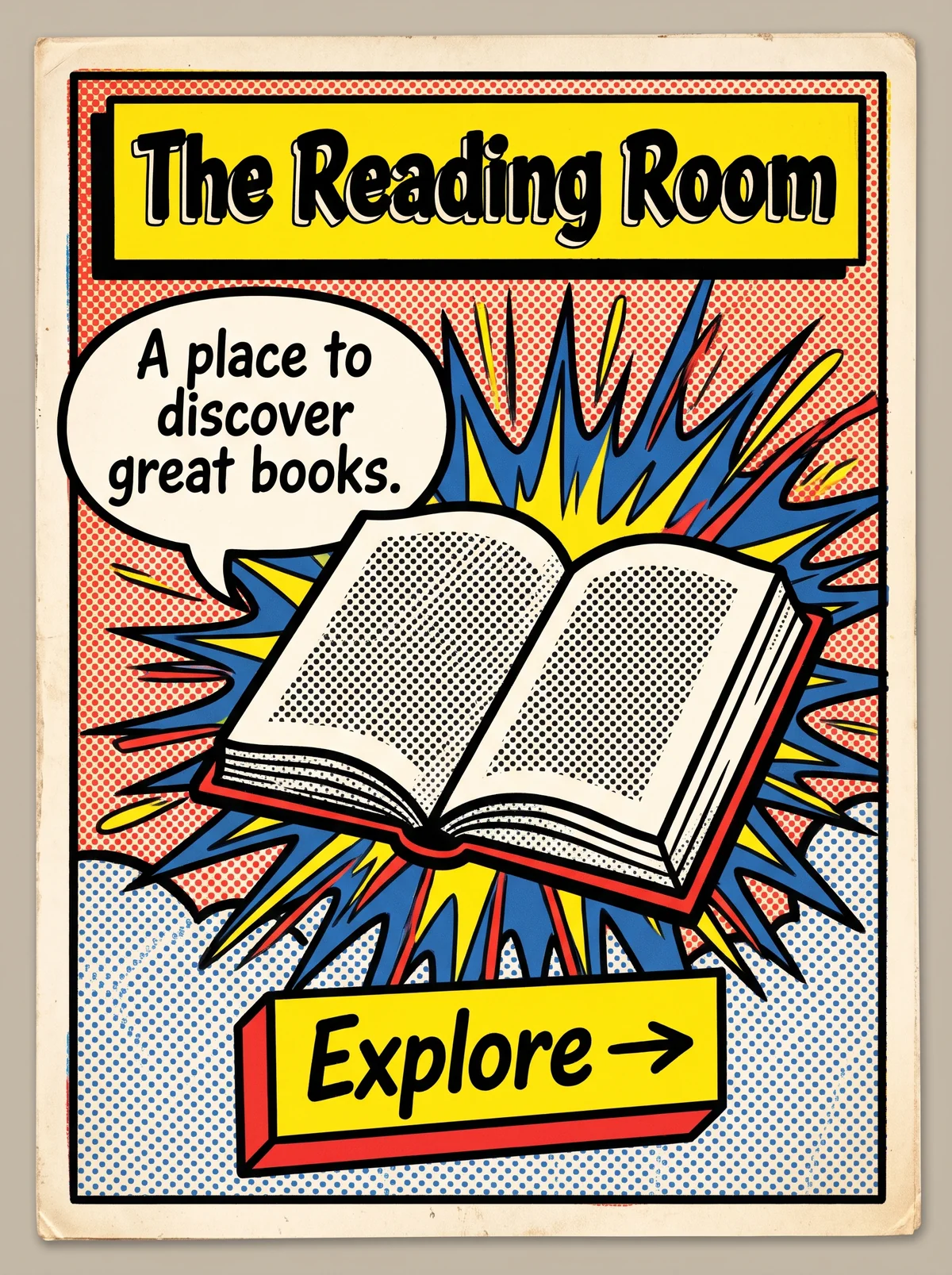
Comic-style card in a heavy black frame. The top background is red halftone dots, the bottom is blue halftone dots on white. A yellow box at the top holds "The Reading Room" in bold, outlined comic lettering. At left, a white speech bubble reads "A place to discover great books." In the center, an open book with halftone-dotted pages sits in front of a blue, yellow, and red starburst. At the bottom, a yellow three-dimensional slab button with a red edge, labeled "Explore" with an arrow.
The Reading Room in Pop Art. An interpretation of the shared “The Reading Room” brief, not a historical work. Supplied by Ryan Grissinger.

Philosophy

Bring mass culture into fine art. Advertising, comics, and consumer goods are worthy subjects.

Historical context

Origins
Britain in the mid-1950s, then the United States.
Period
Mid-1950s to 1970
Influences
Dada, Advertising, Comic books, Consumer culture
Notable figures
Richard Hamilton, Eduardo Paolozzi, Andy Warhol, Roy Lichtenstein, Claes Oldenburg

Drafted from general design history. Sources pending.

What the example shows

Observations tied to the taxonomy, including where the example departs from the profile.

  • 05 · Texture & Material

    Visible Ben-Day halftone dots in red and blue reference commercial comic printing.

  • 04 · Line & Borders

    Thick black outlines around every shape, as in Lichtenstein's paintings.

  • 01 · Color

    Flat primary red, blue, and yellow on cream, loud and cheerful.

  • 13 · Imagery & Illustration

    An everyday book is treated as a comic icon, set against a starburst. A mass-produced object raised to art.

  • 14 · Ornamentation

    A speech bubble, a title box, and a burst replace traditional ornament with the language of comics.

Often confused with

The styles closest to Pop Art, and what sets each apart.

Memphis

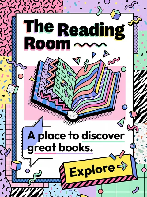
Pop Art borrows from comics and advertising, with halftone dots and thick outlines; Memphis builds its own playful language of squiggles, patterns, and clashing pastels.

14 · Ornamentation
Pop Art Comic speech bubbles, bursts, and Ben-Day dots.
Memphis Abstract squiggles and patterns.
01 · Color
Pop Art Flat primary red, yellow, and blue.
Memphis Pastels mixed with brights.
13 · Imagery & Illustration
Pop Art Everyday consumer goods and comic characters.
Memphis Abstract geometric objects.
20 · Historical & Cultural References
Pop Art Fine art of the 1950s and 1960s, led by Warhol and Lichtenstein.
Memphis A design collective in Milan in the 1980s.
View Memphis

Risograph

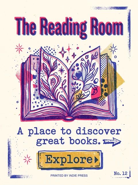
Both use visible dots and bright ink, but Pop Art imitates mass-market comics and ads, while Risograph comes from small-run indie printing with soft, misregistered spot colors.

05 · Texture & Material
Pop Art Even, deliberate Ben-Day dots.
Risograph Grainy texture and misregistered layers.
01 · Color
Pop Art Primary red, yellow, and blue.
Risograph Fluorescent pink and other spot-ink colors.
04 · Line & Borders
Pop Art Thick black outlines.
Risograph Often no outlines; shapes are built from ink layers.
19 · Mood & Personality
Pop Art Loud and ironic.
Risograph Handmade and indie.
View Risograph

Comparisons are drafted from general design history and not yet checked against sources.

The style, layer by layer

Described with the Laboratory's shared vocabulary, from the elements up to digital behavior.

Foundation · fine art

The elements

Color
bold primary saturated
Typography
bold comic
Shape & geometry
bold simple
Line & borders
heavy black outline
Texture & material
halftone printed
Imagery
comic photographic repeated
Ornamentation
decorative

Graphic design adds

The principles

Layout & grid
modular repeated
Space & density
dense
Balance
dynamic
Rhythm
repetitive
Hierarchy
dramatic
Contrast
strong

Web design adds

Digital expression

Dimensionality
flat
Motion
punchy
Interaction
playful
Navigation
hierarchical

Across every layer

Mood and personality

bold playful energetic ironic

Building in this style

Advisory guidance for a web interface. A demonstration may interpret the style differently.

Do

  • Use halftone dots and heavy black outlines.
  • Repeat images in grids with color shifts.
  • Use speech bubbles and comic-style callouts.
  • Pick a few bright primaries and commit.

Avoid

  • Muted, subtle palettes.
  • Delicate typography.

Working palette

  • #FFFFFF

    Background

  • #111111

    Foreground

  • #FF1E1E

    Primary

  • #0057FF

    Secondary

  • #FFE11A

    Accent

Headings
comic display
Body
grotesque sans
Corner radius
0px
Borders
heavy comic outline

Accessibility

  • Halftone patterns behind text reduce legibility.
  • Comic display faces should not carry body copy.

Responsive behavior

  • Reduce grid repetitions on small screens; keep the color.

Sources

Sources pending. This profile was drafted from general design history and has not yet been checked against primary or scholarly sources.

π