06 · Design movement · c. 1910–1940, peaking in the 1920s and 1930s

Art Deco

Elegant, luxurious, geometric

Draft profile · not yet reviewed against sources

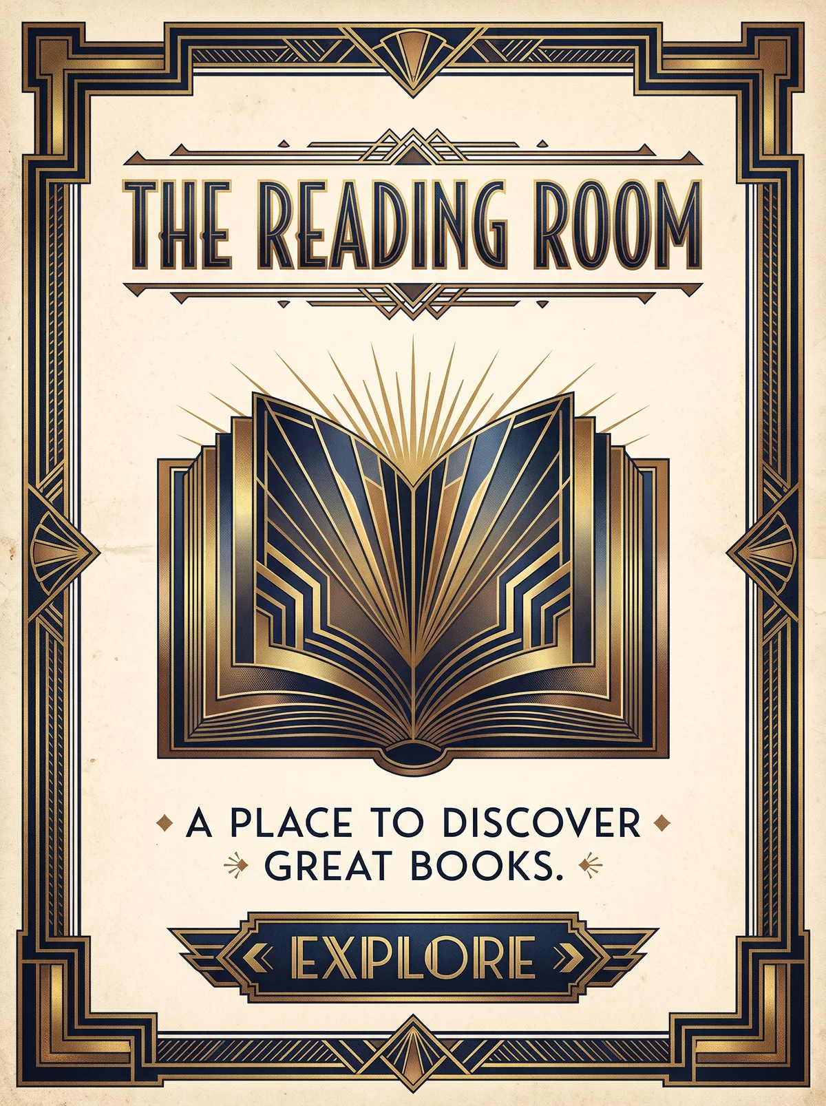
Symmetrical poster on cream paper inside a stepped navy and gold border. "The Reading Room" in tall, condensed geometric capitals across the top. In the center, an open book rendered as a sunburst of gold rays and stacked navy chevrons. Below, the tagline "A place to discover great books." in spaced capitals between small diamond ornaments. At the bottom, a navy banner with chevron ends reading "Explore".
The Reading Room in Art Deco. An interpretation of the shared “The Reading Room” brief, not a historical work. Supplied by Ryan Grissinger.

Philosophy

Modern luxury. Celebrate the machine age, speed, and glamour through geometric ornament and rich materials.

Historical context

Origins
France, named after the 1925 Exposition internationale des Arts Décoratifs et Industriels Modernes in Paris; spread internationally.
Period
c. 1910–1940, peaking in the 1920s and 1930s
Influences
Cubism, Vienna Secession, Ancient Egyptian art, Machine Age design
Notable figures
A. M. Cassandre, Erté, Émile-Jacques Ruhlmann, Tamara de Lempicka, René Lalique

Drafted from general design history. Sources pending.

What the example shows

Observations tied to the taxonomy, including where the example departs from the profile.

  • 09 · Balance & Tension

    Strict bilateral symmetry around a central vertical axis. Every element mirrors.

  • 02 · Typography

    Tall, condensed geometric capitals for the title and spaced capitals for the tagline.

  • 13 · Imagery & Illustration

    The open book becomes a sunburst of rays and nested chevrons, the movement's signature motifs.

  • 14 · Ornamentation

    Ornament is geometric rather than floral: steps, fans, and parallel lines frame the page.

  • 01 · Color

    Navy, metallic gold, and cream, a restrained palette made rich by the gold.

Often confused with

The styles closest to Art Deco, and what sets each apart.

Art Nouveau

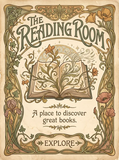
Art Nouveau flows in organic curves drawn from plants; Art Deco, which followed it, turns ornament geometric, with chevrons, sunbursts, and stepped forms.

03 · Shape & Geometry
Art Deco Geometric: chevrons, sunbursts, and stepped forms.
Art Nouveau Organic: whiplash curves, stems, and flowers.
09 · Balance & Tension
Art Deco Strict symmetry.
Art Nouveau Asymmetric, flowing arrangements.
02 · Typography
Art Deco Tall, condensed geometric capitals.
Art Nouveau Hand-drawn lettering that curves with the design.
01 · Color
Art Deco Black, gold, and metallic contrast.
Art Nouveau Muted greens, ochres, and soft pastels.
20 · Historical & Cultural References
Art Deco The 1920s and 1930s, celebrating the machine age.
Art Nouveau About 1890 to 1910, drawing on nature.
View Art Nouveau

Comparisons are drafted from general design history and not yet checked against sources.

The style, layer by layer

Described with the Laboratory's shared vocabulary, from the elements up to digital behavior.

Foundation · fine art

The elements

Color
gold black jewel toned
Typography
geometric display condensed all caps
Shape & geometry
geometric stepped sunburst symmetrical
Line & borders
fine parallel ornamental
Texture & material
metallic lacquered polished
Imagery
stylized geometric
Ornamentation
decorative elaborate

Graphic design adds

The principles

Layout & grid
symmetrical axial
Space & density
balanced framed
Balance
stable symmetrical
Rhythm
regular repeating
Hierarchy
dominant monumental
Contrast
high contrast luminous

Web design adds

Digital expression

Dimensionality
embossed layered
Motion
elegant cinematic
Interaction
polished
Navigation
hierarchical

Across every layer

Mood and personality

elegant luxurious geometric glamorous

Building in this style

Advisory guidance for a web interface. A demonstration may interpret the style differently.

Do

  • Build symmetry around a central vertical axis.
  • Use stepped forms, sunbursts, chevrons, and fan motifs.
  • Pair metallic gold with black or deep jewel tones.
  • Set headlines in tall, geometric display capitals.

Avoid

  • Organic, flowing curves.
  • Casual or handwritten type.
  • Pastel palettes.

Working palette

  • #0E0E0E

    Background

  • #F3E9D2

    Foreground

  • #C9A227

    Primary

  • #1F4E5F

    Secondary

  • #7A1F2B

    Accent

Headings
geometric display
Body
geometric sans
Corner radius
0px
Borders
stepped ornamental

Accessibility

  • Decorative display capitals are hard to read in long runs; keep them to headlines.
  • Gold on black passes contrast but gold on cream does not.

Responsive behavior

  • Reduce ornamental borders on small screens; keep the central axis.

Sources

Sources pending. This profile was drafted from general design history and has not yet been checked against primary or scholarly sources.

π