
04 · Digital design trend · Architectural roots in the 1950s; web revival from 2014

Brutalism

Also known as Neo-Brutalism, Web Brutalism

Bold, raw, confrontational

Draft profile · not yet reviewed against sources

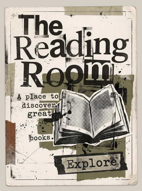
Off-white poster with heavy black rules and corner labels reading "Error" and "Archive". "The Reading Room" is set in huge condensed black capitals on acid-yellow and lime-green blocks edged with yellow and black hazard stripes. Below, a grainy halftone photocopy of an open book sits in a rough black frame, surrounded by blue grid panels, a star, an asterisk, and two large X marks. Monospace labels read "File_No: 08". A white box with a striped top reads "A place to discover great books." in monospace capitals. At the bottom, a wide acid-yellow slab with a hard black shadow reads "Explore" with an arrow.
The Reading Room in Brutalism. An interpretation of the shared “The Reading Room” brief, not a historical work. Supplied by Ryan Grissinger.

Philosophy

Honesty of materials. Show the structure raw and unpolished, and refuse the smooth sameness of templated design.

Historical context

Origins
Architecture of the 1950s to 1970s (from béton brut, raw concrete), revived as a web design trend in the 2010s.
Period
Architectural roots in the 1950s; web revival from 2014
Influences
Brutalist architecture, Early web design, Swiss Modernism, Punk zines
Notable figures
Le Corbusier, Alison and Peter Smithson, Pascal Deville

Drafted from general design history. Sources pending.

What the example shows

Observations tied to the taxonomy, including where the example departs from the profile.

  • 02 · Typography

    Huge condensed capitals fill the width of the page, with monospace for everything else. Type is blunt, not refined.

  • 04 · Line & Borders

    Heavy black rules, hazard stripes, and hard-edged frames expose the structure instead of hiding it.

  • 15 · Dimensionality

    The Explore slab has a hard offset shadow, the neo-brutalist signature, with no blur at all.

  • 05 · Texture & Material

    Photocopy grain and coarse halftone give the image a raw, unprocessed surface.

  • 17 · Interaction & Feedback

    The call to action is the largest object on the page after the title. Nothing about what to click is subtle.

Often confused with

The styles closest to Brutalism, and what sets each apart.

Grunge Typography

Both look raw, but Brutalism is blunt and structural, exposing the system, while Grunge Typography is expressive and distressed, treating type as emotion.

02 · Typography
Brutalism Default system fonts and monospace, used plainly.
Grunge Typography Mixed, distorted, and degraded faces.
05 · Texture & Material
Brutalism Flat, unprocessed surfaces.
Grunge Typography Grain, scratches, tape, and photocopy wear.
06 · Layout & Grid
Brutalism Rigid blocks and visible structure.
Grunge Typography A broken grid with collisions and overlaps.
20 · Historical & Cultural References
Brutalism A web design trend of the 2010s.
Grunge Typography 1990s print, led by David Carson and Ray Gun magazine.
View Grunge Typography

Comparisons are drafted from general design history and not yet checked against sources.

The style, layer by layer

Described with the Laboratory's shared vocabulary, from the elements up to digital behavior.

Foundation · fine art

The elements

Color
raw high contrast flat
Typography
monospace system grotesque
Shape & geometry
rectilinear blocky
Line & borders
heavy hard visible
Texture & material
raw flat
Imagery
photographic unprocessed
Ornamentation
minimal

Graphic design adds

The principles

Layout & grid
rigid exposed
Space & density
dense compact
Balance
blunt asymmetric
Rhythm
repetitive
Hierarchy
dominant blunt
Contrast
stark

Web design adds

Digital expression

Dimensionality
flat hard shadow
Motion
instant
Interaction
immediate tactile
Navigation
unconventional exposed

Across every layer

Mood and personality

bold raw confrontational honest

Building in this style

Advisory guidance for a web interface. A demonstration may interpret the style differently.

Do

  • Expose structure: visible borders, default-looking controls, raw grids.
  • Use hard offset shadows instead of soft ones.
  • Let type be big, heavy, and blunt.
  • Prefer instant state changes over animation.

Avoid

  • Soft gradients and blurred shadows.
  • Rounded corners.
  • Polished stock imagery.

Working palette

  • #FFFFFF

    Background

  • #000000

    Foreground

  • #FFE600

    Primary

  • #FF5C00

    Secondary

  • #2B59FF

    Accent

Headings
grotesque sans
Body
monospace
Corner radius
0px
Borders
heavy outline

Accessibility

  • Raw does not have to mean broken; keep focus states visible and semantic markup intact.
  • Default-looking controls are discoverable, which helps usability.

Responsive behavior

  • Let blocks stack in source order; brutalism tolerates plain reflow well.

Sources

Sources pending. This profile was drafted from general design history and has not yet been checked against primary or scholarly sources.

π