12 · Art movement · c. 1915–1934

Constructivism

Also known as Avant-Garde, Russian Avant-Garde

Dynamic, revolutionary, graphic

Draft profile · not yet reviewed against sources

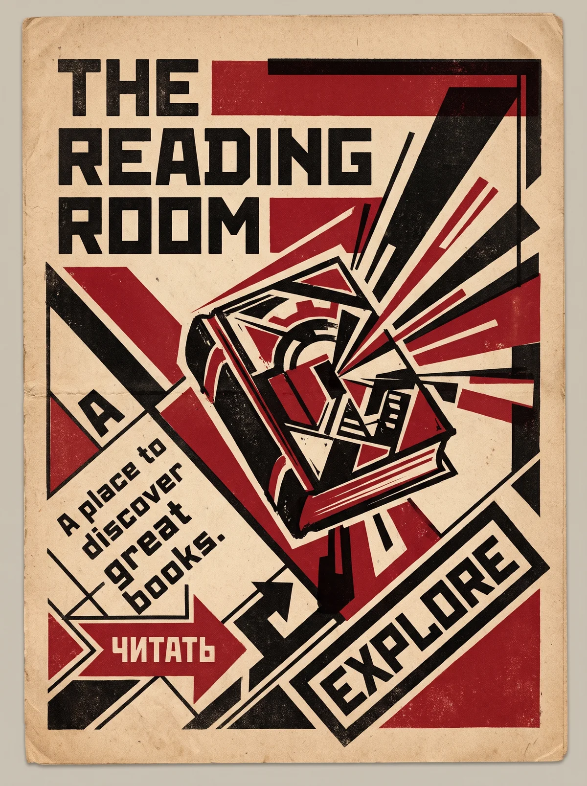
Worn, folded poster on tan paper, printed in black and red. At top left, "THE READING ROOM" in heavy blocky capitals on three lines. A tilted book with a gear and geometric patterns on its cover sits at the center, with black and red rays bursting from its pages toward the upper right. Along the left diagonal, the tagline "A place to discover great books." is set at an angle inside a diagonal band. At bottom left, a red arrow labeled with the Cyrillic word "ЧИТАТЬ". At bottom right, a diagonal framed button labeled "EXPLORE" in large capitals, with a black arrow pointing toward it.
The Reading Room in Constructivism. An interpretation of the shared “The Reading Room” brief, not a historical work. Supplied by Ryan Grissinger.

Philosophy

Art in the service of society. Design is construction: purposeful, industrial, and revolutionary.

Historical context

Origins
Russia and the early Soviet Union, after the 1917 revolution.
Period
c. 1915–1934
Influences
Cubism, Futurism, Suprematism
Notable figures
Alexander Rodchenko, El Lissitzky, Varvara Stepanova, Vladimir Tatlin, Gustav Klutsis

Drafted from general design history. Sources pending.

What the example shows

Observations tied to the taxonomy, including where the example departs from the profile.

  • 09 · Balance & Tension

    Strong diagonals pull the eye across the page. Nothing sits level, so the poster feels in motion.

  • 01 · Color

    Only black, red, and the cream of the paper. The limited palette is the revolutionary-poster signature.

  • 02 · Typography

    Heavy, blocky capitals, and the tagline and button are set on an angle. Text is treated as a graphic force, not a caption.

  • 17 · Interaction & Feedback

    A red arrow and a large diagonal EXPLORE slab point the way. The call to action is a command.

  • 13 · Imagery & Illustration

    The book is built from angular planes and a gear motif, with rays bursting outward. It is a machine for spreading ideas.

  • 20 · Historical & Cultural References

    The Cyrillic word ЧИТАТЬ ("read") and the gear and ray motifs reference early Soviet posters directly. This is the one deliberate historical quote on the page.

Often confused with

The styles closest to Constructivism, and what sets each apart.

Bauhaus

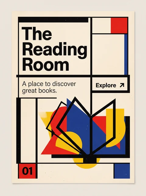
Constructivism uses geometry as political persuasion, with hard diagonals, red and black, and photomontage; Bauhaus uses it to teach good form for everyday life.

01 · Color
Constructivism Red and black on cream, often nothing else.
Bauhaus Red, yellow, and blue.
09 · Balance & Tension
Constructivism Aggressive diagonals that suggest motion and urgency.
Bauhaus Measured, balanced compositions.
13 · Imagery & Illustration
Constructivism Photomontage of workers, crowds, and machines.
Bauhaus Abstract forms and object photography.
19 · Mood & Personality
Constructivism Urgent, revolutionary, and persuasive.
Bauhaus Rational and educational.
20 · Historical & Cultural References
Constructivism Soviet Russia, late 1910s to early 1930s.
Bauhaus Germany, 1919 to 1933.
View Bauhaus

Comparisons are drafted from general design history and not yet checked against sources.

The style, layer by layer

Described with the Laboratory's shared vocabulary, from the elements up to digital behavior.

Foundation · fine art

The elements

Color
red black limited
Typography
bold sans serif condensed
Shape & geometry
angular diagonal
Line & borders
heavy bars
Texture & material
flat printed
Imagery
photomontage
Ornamentation
minimal

Graphic design adds

The principles

Layout & grid
diagonal dynamic
Space & density
compact
Balance
dynamic
Rhythm
kinetic
Hierarchy
dramatic
Contrast
stark

Web design adds

Digital expression

Dimensionality
flat
Motion
mechanical
Interaction
direct
Navigation
linear

Across every layer

Mood and personality

dynamic revolutionary graphic urgent

Building in this style

Advisory guidance for a web interface. A demonstration may interpret the style differently.

Do

  • Compose on strong diagonals.
  • Use red, black, and paper white.
  • Combine photomontage with heavy sans-serif type.
  • Use bars and blocks to direct the eye.

Avoid

  • Soft, rounded shapes.
  • Pastel or broad palettes.
  • Static symmetry.

Working palette

  • #EDE6D6

    Background

  • #111111

    Foreground

  • #C8102E

    Primary

  • #2B2B2B

    Secondary

Headings
condensed sans
Body
grotesque sans
Corner radius
0px
Borders
heavy bars

Accessibility

  • Rotated text is hard to read; keep diagonal type to headlines and keep it short.

Responsive behavior

  • Reduce diagonal angles on narrow screens to avoid clipped text.

Sources

Sources pending. This profile was drafted from general design history and has not yet been checked against primary or scholarly sources.

π