20 · Graphic design movement · c. 1965–1972

Psychedelic Design

Also known as Counterculture Design

Expressive, surreal, rebellious

Draft profile · not yet reviewed against sources

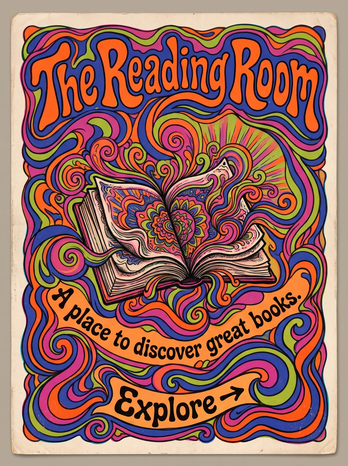
Poster on aged cream card, with the whole frame filled by swirling bands of orange, magenta, blue, and green outlined in black. At top, "The Reading Room" in melting, bulbous orange lettering outlined in blue. In the center, an open book with a mandala on its pages, with swirls and rays rising from it. Across the lower middle, the tagline "A place to discover great books." in black on a curved orange banner. At the bottom, a banner labeled "Explore" with an arrow, set inside the swirls.
The Reading Room in Psychedelic Design. An interpretation of the shared “The Reading Room” brief, not a historical work. Supplied by Ryan Grissinger.

Philosophy

Expand perception. Color, pattern, and warped lettering are meant to be experienced as much as read.

Historical context

Origins
San Francisco concert posters and the 1960s counterculture; also London.
Period
c. 1965–1972
Influences
Art Nouveau, Op Art, Vienna Secession lettering, Pop Art
Notable figures
Wes Wilson, Victor Moscoso, Bonnie MacLean, Rick Griffin, Martin Sharp

Drafted from general design history. Sources pending.

What the example shows

Observations tied to the taxonomy, including where the example departs from the profile.

  • 01 · Color

    Highly saturated complementary colors, orange against blue and magenta against green, make the edges vibrate.

  • 02 · Typography

    Melting, bending lettering fills its space and follows the curves, in the manner of Wes Wilson's concert posters.

  • 07 · Space & Density

    The page is dense. Almost no empty ground is left, and the swirls flow continuously.

  • 10 · Rhythm & Repetition

    Repeated swirls and radiating lines set a pulsing rhythm across the whole poster.

  • 13 · Imagery & Illustration

    The book is alive: its pages ripple and bloom into a mandala, and the tagline and button sit inside the flow.

Often confused with

The styles closest to Psychedelic Design, and what sets each apart.

Art Nouveau

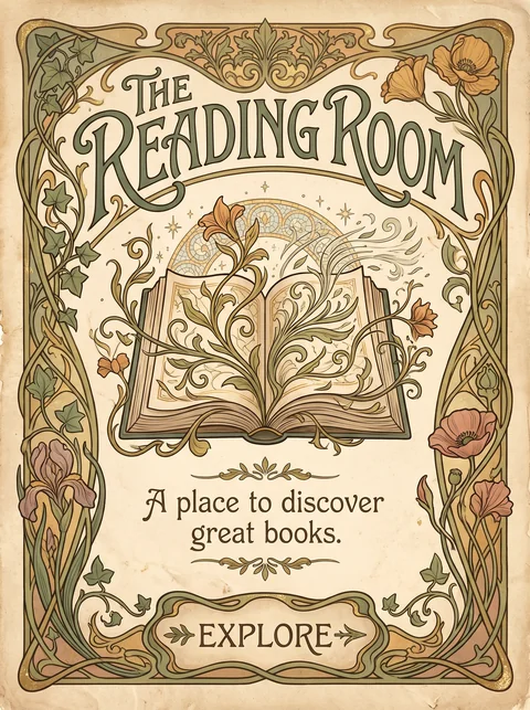
1960s psychedelic posters revived Art Nouveau's flowing lettering and curves, then pushed them into vibrating, clashing color and type at the edge of legibility.

01 · Color
Psychedelic Design Saturated complementary colors that vibrate.
Art Nouveau Muted, natural colors.
02 · Typography
Psychedelic Design Lettering that melts to fill its shape.
Art Nouveau Decorative but readable lettering.
07 · Space & Density
Psychedelic Design Every space filled.
Art Nouveau Ornament with room to breathe.
20 · Historical & Cultural References
Psychedelic Design San Francisco concert posters, mid to late 1960s.
Art Nouveau About 1890 to 1910.
View Art Nouveau

Comparisons are drafted from general design history and not yet checked against sources.

The style, layer by layer

Described with the Laboratory's shared vocabulary, from the elements up to digital behavior.

Foundation · fine art

The elements

Color
vibrating complementary saturated
Typography
hand lettered warped
Shape & geometry
organic melting
Line & borders
flowing
Texture & material
illustrated
Imagery
illustrated surreal
Ornamentation
maximalist

Graphic design adds

The principles

Layout & grid
freeform
Space & density
dense
Balance
dynamic
Rhythm
chaotic
Hierarchy
expressive
Contrast
vibrating

Web design adds

Digital expression

Dimensionality
layered
Motion
flowing
Interaction
expressive
Navigation
unconventional

Across every layer

Mood and personality

expressive surreal rebellious euphoric

Building in this style

Advisory guidance for a web interface. A demonstration may interpret the style differently.

Do

  • Use vibrating complementary colors side by side.
  • Warp and fill lettering to shape.
  • Let illustration fill the whole frame.
  • Keep real content in a calmer layer on top.

Avoid

  • Restraint and whitespace.
  • Neutral sans-serif display type.

Working palette

  • #FFF1D6

    Background

  • #2A0A3D

    Foreground

  • #FF5F1F

    Primary

  • #8A2BE2

    Secondary

  • #00B894

    Accent

  • #FF2E93

    Accent 2

Headings
hand lettered display
Body
humanist sans
Corner radius
32px
Borders
flowing organic

Accessibility

  • Warped lettering is unreadable for many people; never use it for content or labels.
  • Vibrating color pairs can trigger discomfort; avoid them behind text and in motion.

Responsive behavior

  • Keep the poster art as a single banner; body content reflows normally.

Sources

Sources pending. This profile was drafted from general design history and has not yet been checked against primary or scholarly sources.

π